Peach’s
Best Squarespace template header image

The Best Squarespace Template for Every Purpose

A pro designer selects the right template for you.

Introduction

I’m going to tell you which Squarespace template is the best for what you’re doing.

Why?

There’s one question that people ask me more than anything.

Every. Single. Day.

I get asked “What’s the best Squarespace template for …?”

So I’ve decided to share everything I know about choosing Squarespace templates.

I’m a professional designer and developer who’s worked with a bunch of clients – from bloggers to eCommerce to photographers.

I’ve analysed every Squarespace template for every profession and purpose I could think of.

I’m going to tell you the right Squarespace template for you.
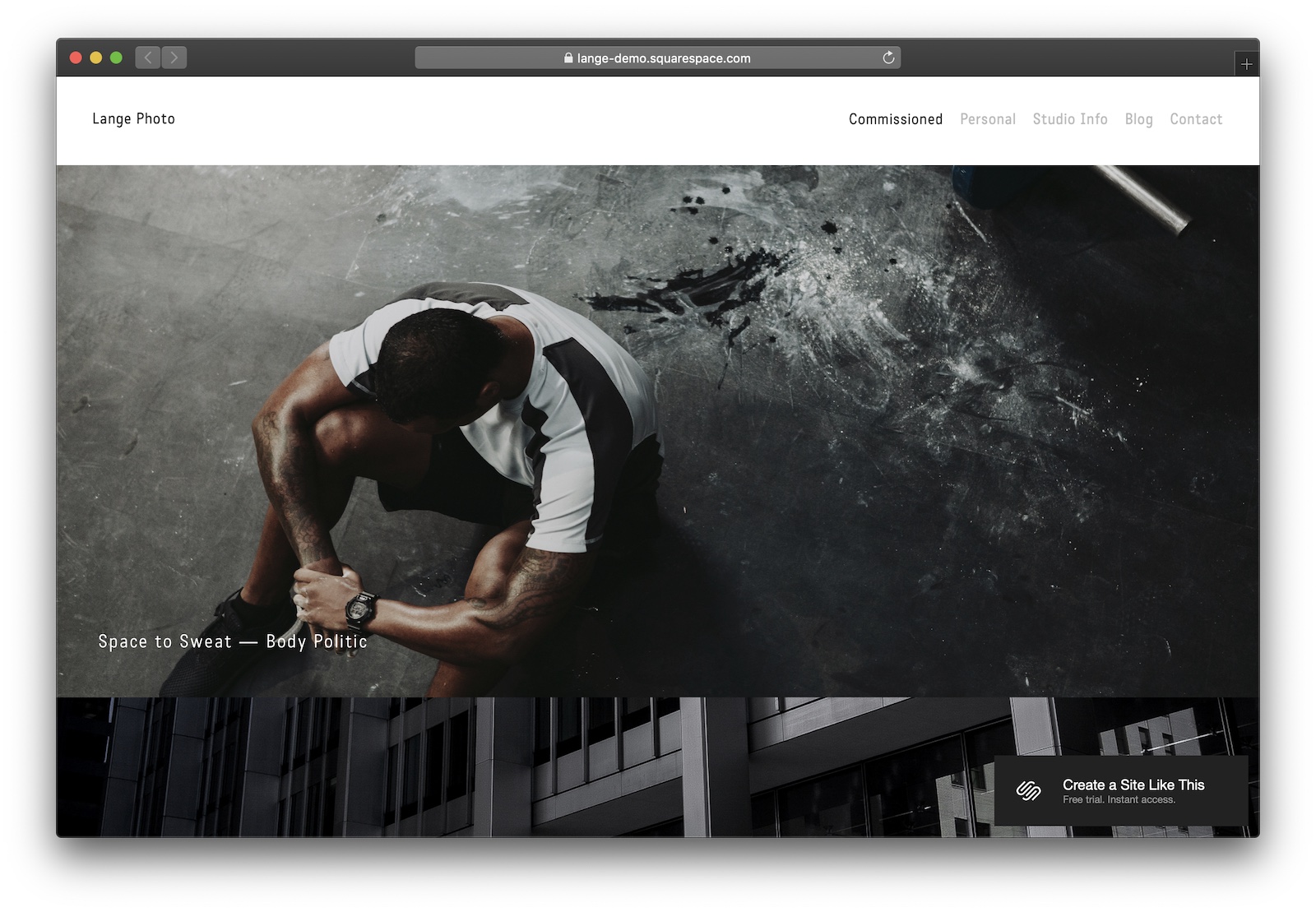
Table of Contents

What’s the best Squarespace template for photographers?

#1 Lange

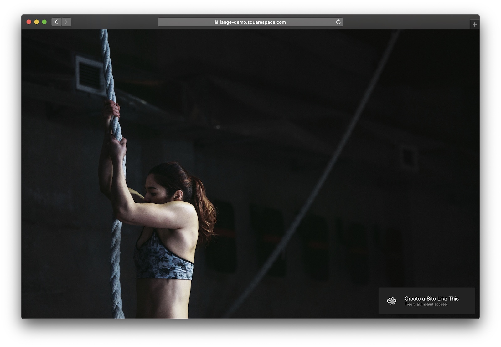
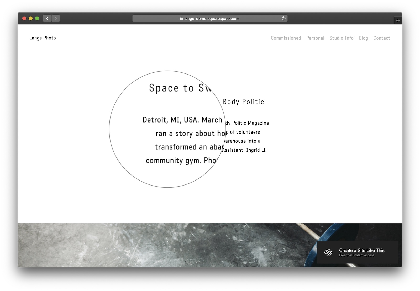
Lange is my top pick for photographers. It’s got lovely full-bleed images, space for photographers’ notes and credits, and intuitive navigation.
Designer Notes

  • Full-bleed images make Lange stand-out. They cause the eye to focus on the photography and the website chrome just disappears.
  • Vertical scrolling – rather than a gallery or carousel – mean this theme’s always going to be user-friendly, even on mobile.
  • The font is not going to be suited to some photographers – make sure you customise it in your Squarespace dashboard.
  • Adore the inclusion of photographers’ notes to provide a personal touch to your photos.

#2 Wexley

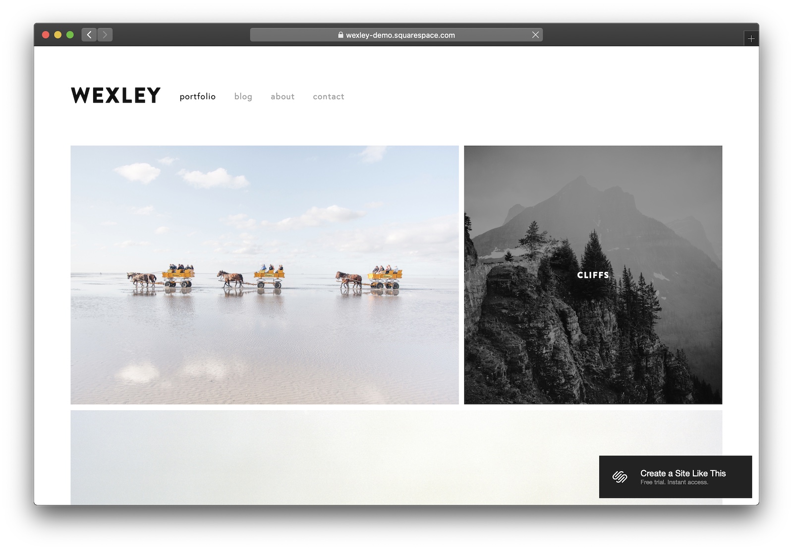
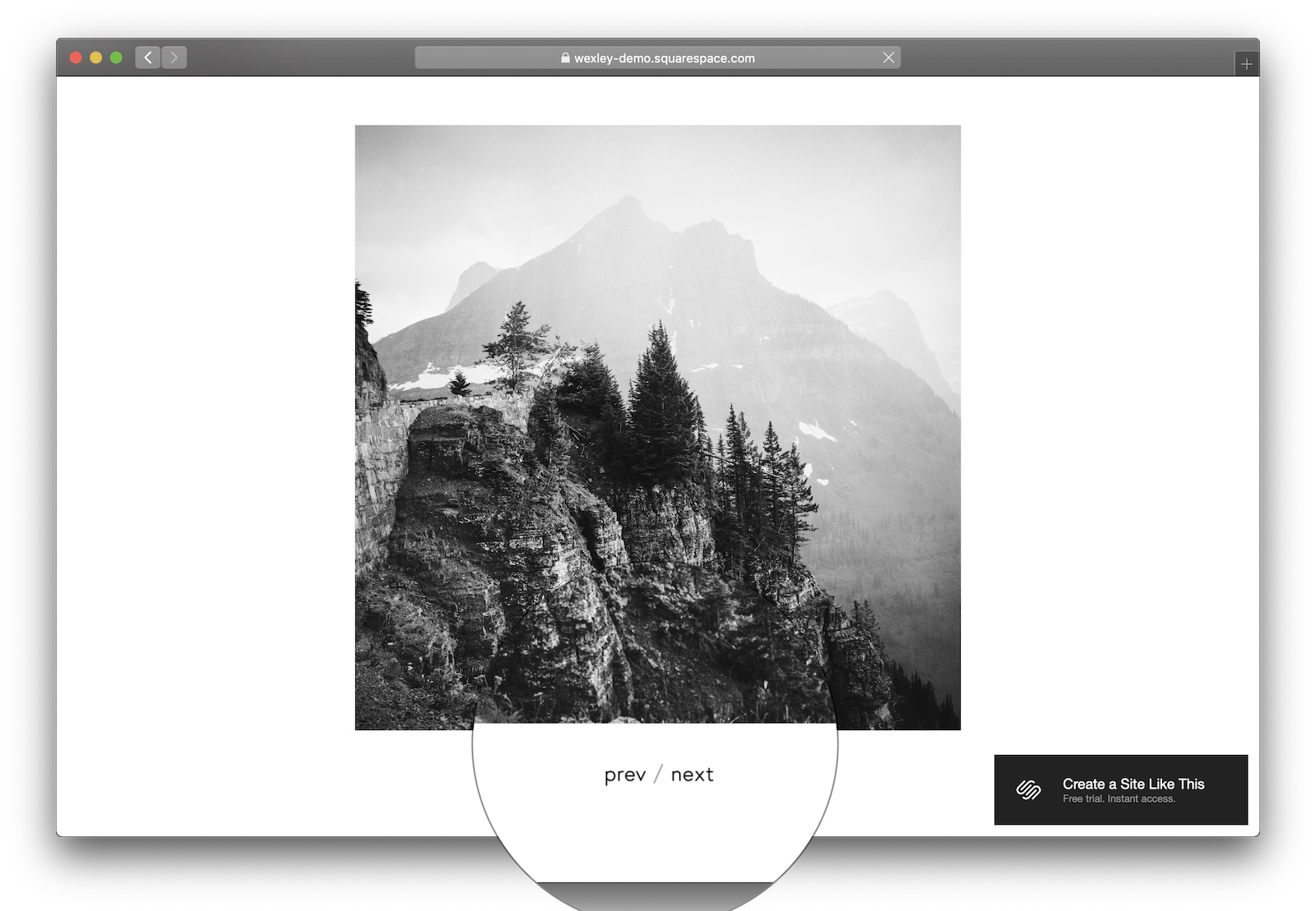
Wexley is a great theme for general purpose photography. Its best feature is the home page collage to showcase your recent work.
Designer Notes

  • The gallery on the home page is really nicely done, and has some great, subtle hover effects.
  • The carousel is a double-edged sword. On the one hand, it brings full focus to the imagery. But it also restricts viewers to left-right navigation through prev / next buttons, keyboard navigation, or clicking on the sides of images.
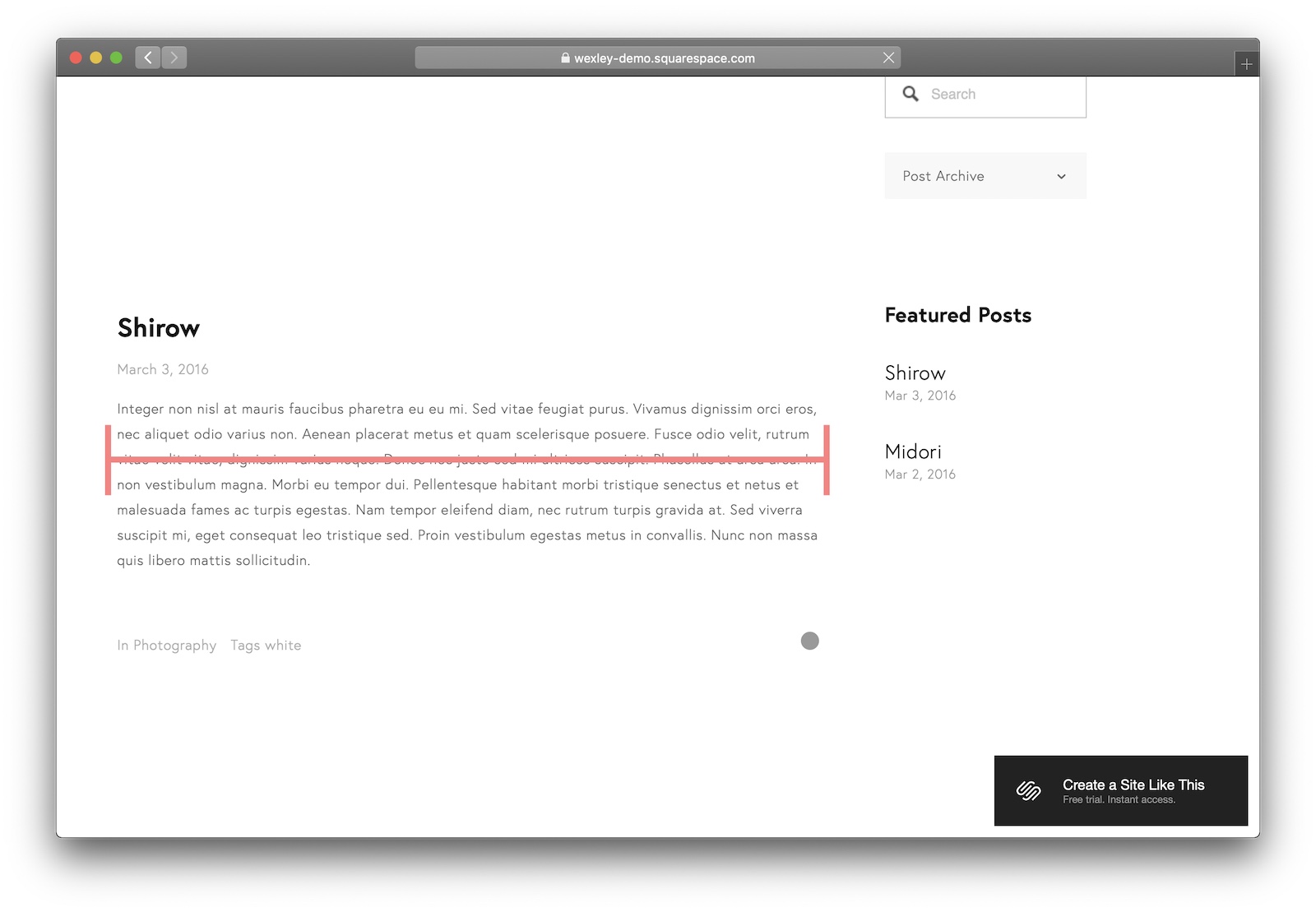
  • One thing I really dislike about Wexley is the width on the blog pages. It’s just too wide – typographers know that two width should be two to three alphabets across. This might not be an issue for you if you’re not doing much writing on your site though.
  • The Futura variant they’re using as the default font is gorgeous.

#3 Margot

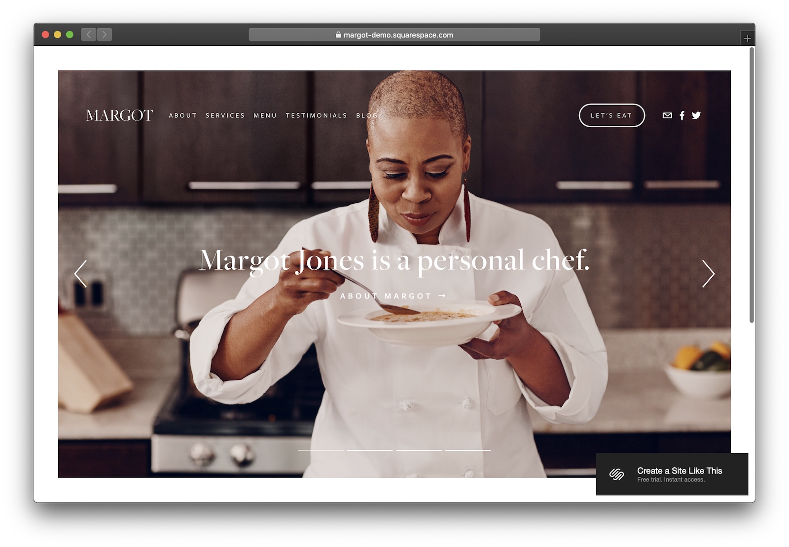
Margot is the theme to use if you’ve got a lot of text and other media to go along with your photography.
Designer Notes

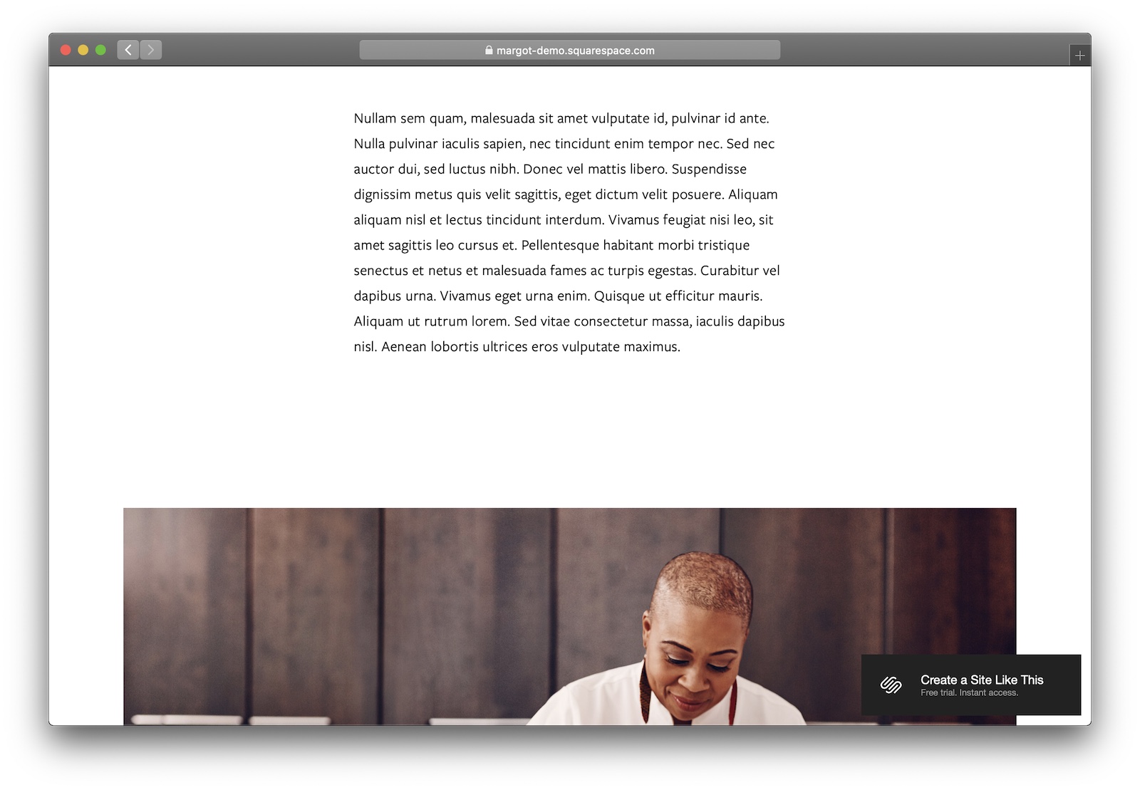
  • Margot’s not a pure, minimalist photography theme – it’s best used if you’re a photographer who wants a more traditional website with text, video, and images.
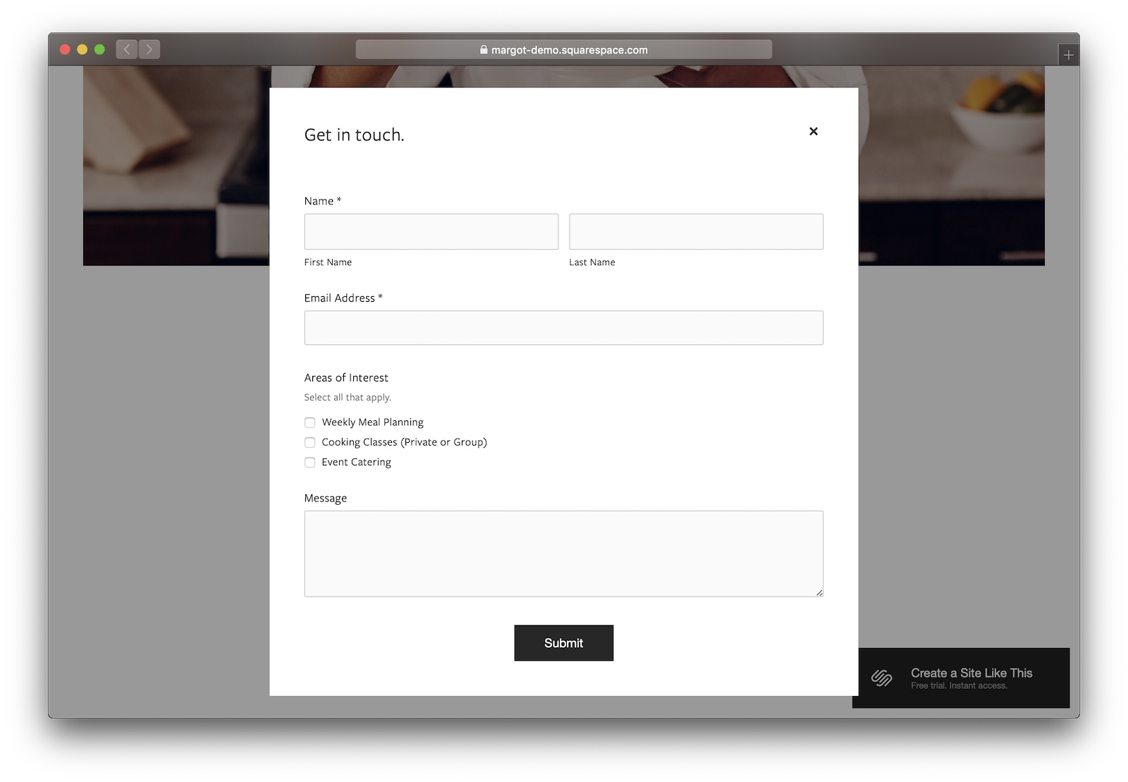
  • Margot comes with a nice pop-up contact form that makes it really easy for potential clients to get in touch with you.
  • It’s really well-suited for photographers doing detailed write-ups alongside photography. (Think food photography, documentarians, and journalists.)
  • Margot might be a good fit if you’re looking for an SEO boost on your photography site. Google loves text – it can’t do much with images.

What’s the best Squarespace template for blogs and writers?

#1 Rally

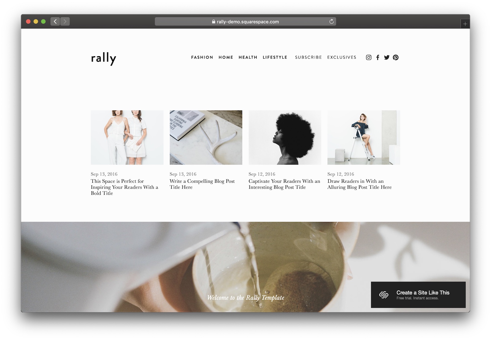
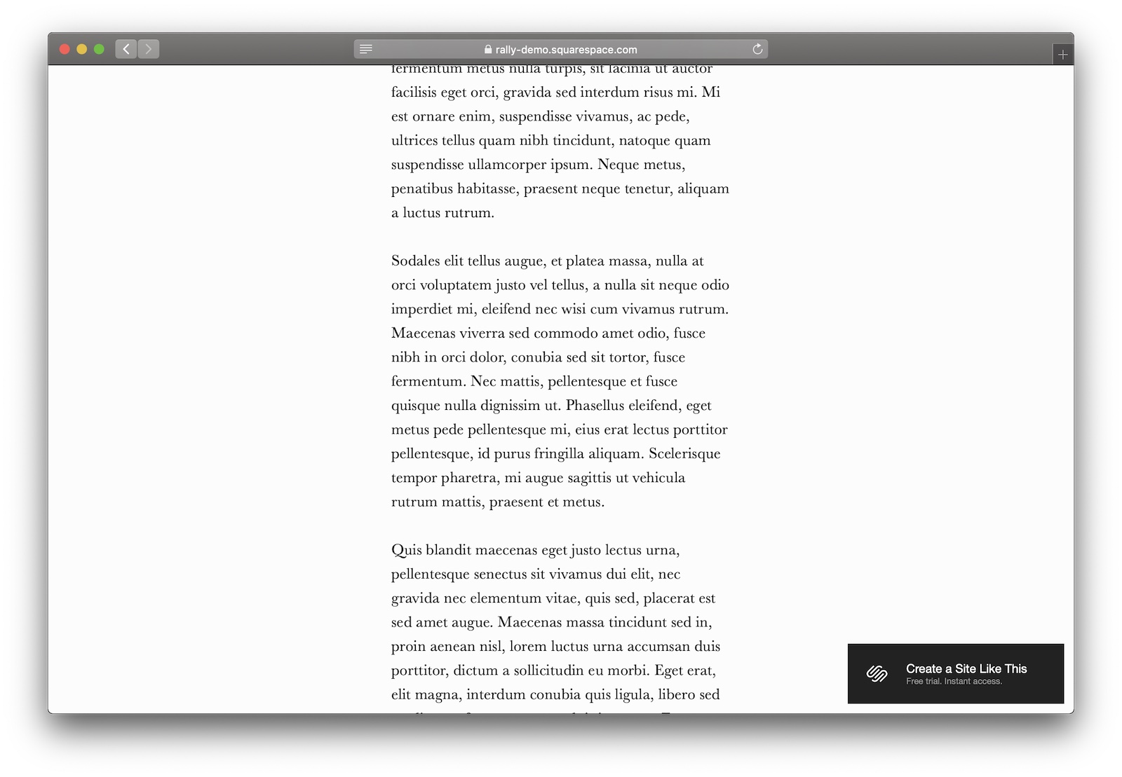
Iconic typography, easy navigation, and click-inducing thumbnails make Rally the best theme for blogs.
Designer Notes

  • The home page is really nicely done. It does a good job of maintaining a minimalist aesthetic while still including enough content to get readers to click through to read the article.
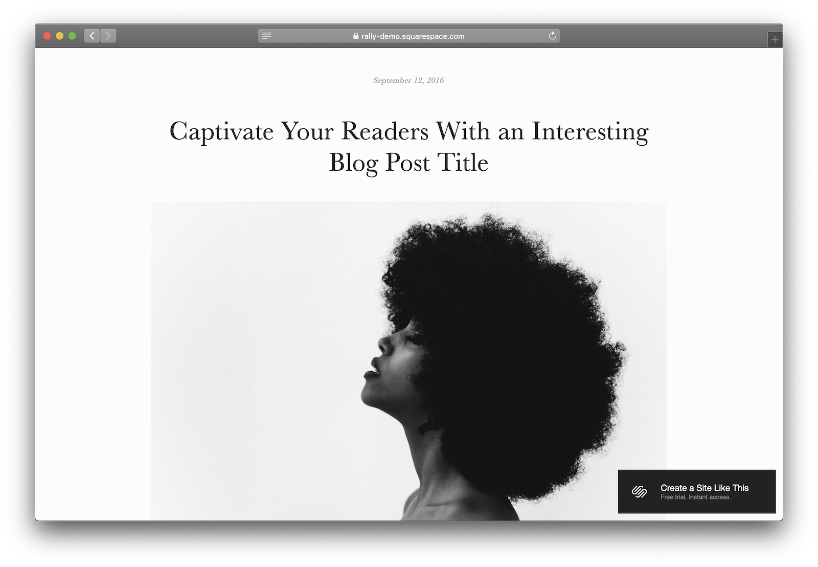
  • Rally stands out because of its article pages – they’re narrower and more minimalistic than any of the other templates. While I personally like narrow width text columns (and so do most readers), if it’s not to your taste you might want to steer clear. The narrow main column creates a really striking contrast between the text content and images, which get full-width treatment.
  • The small caps used in the navigation bar are spot-on as well – Rally is a typographic powerhouse, just what you need for a text-focused blog.

#2 Tudor

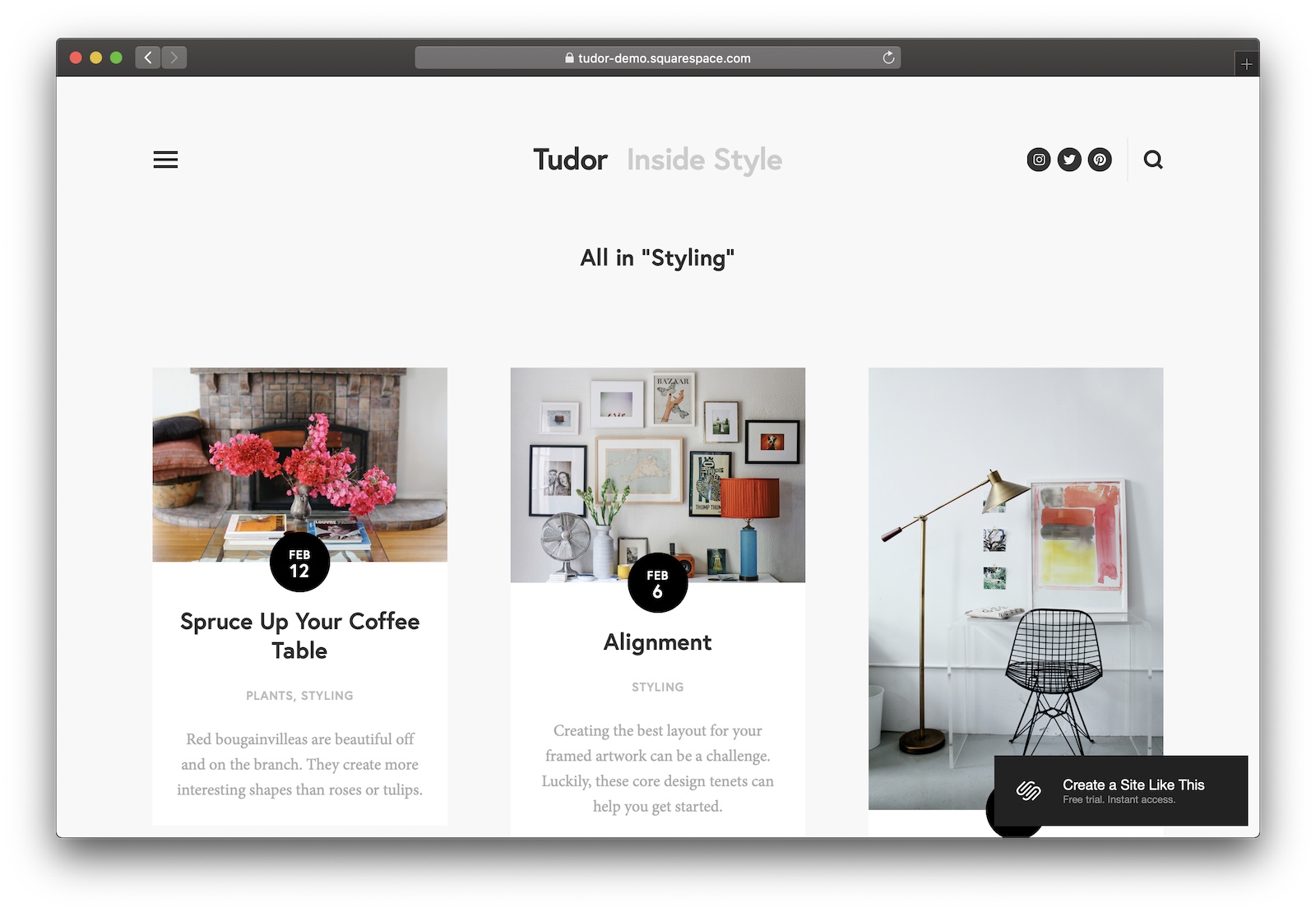
Tudor is a strong offering with a magazine-style layout – some nice design touches balance out the rough edges.
Designer Notes

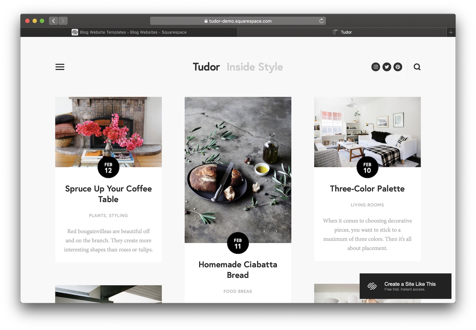
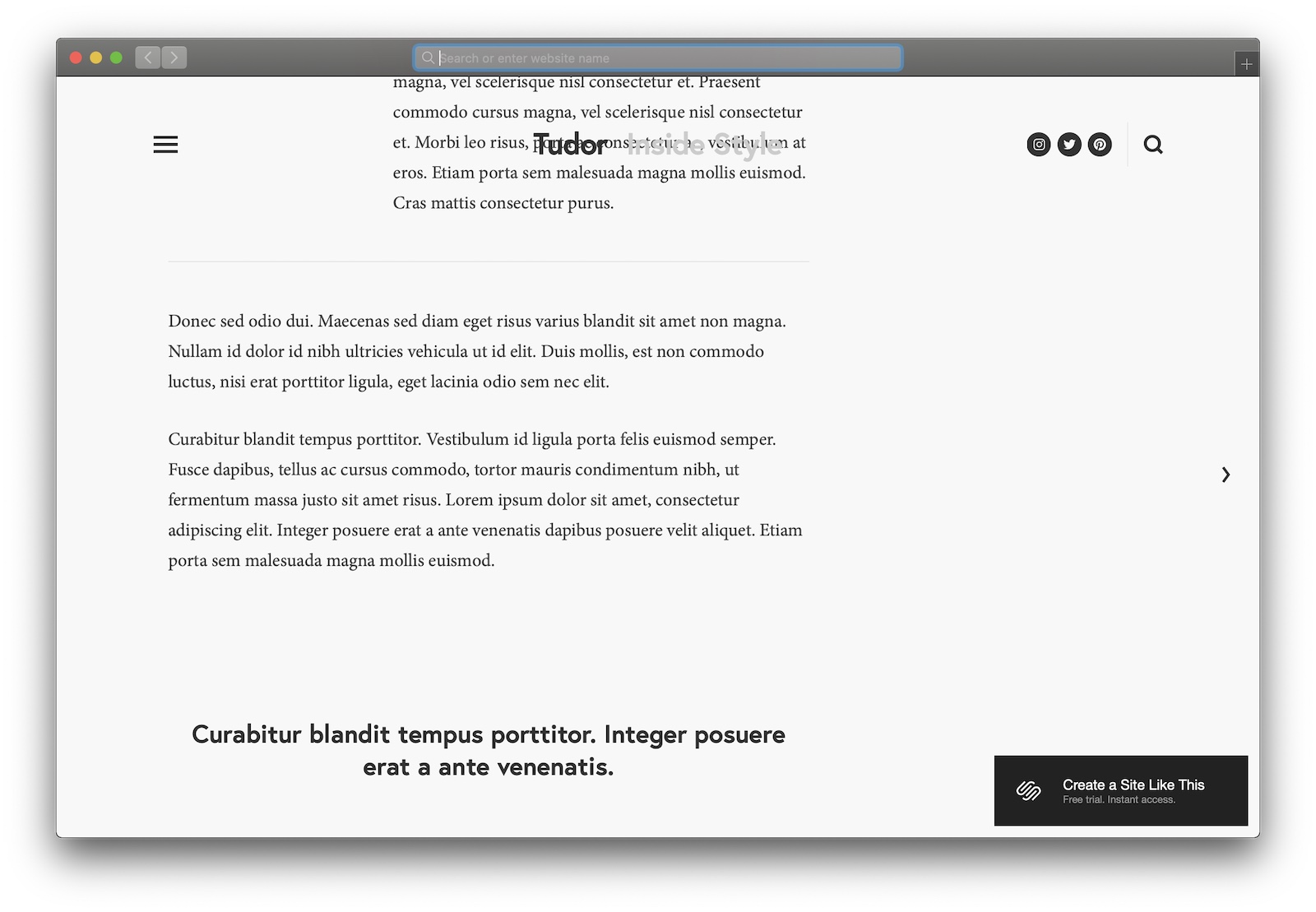
  • Tudor’s home page is pretty good visually. But it fails to give any article the ‘feature’ treatment – every post starts to look the same. (And, frankly, it looks like a Pinterest board.)
  • It’s got great typography and a nice sans-serif typeface – it’ll fit with most brands. I like the dates-in-a-circle markers to create a friendly, homely feel. And the category pages do a nice job of orienting you within the blog’s hierarchy. (Some Squarespace blog templates fail to tell you which category you’re viewing.)
  • Check out how nice the loading animations are. Ooooooooh!
  • There’s no background on the sticky header – when you scroll a post you get some weird overlap between the text and the navigation. Not a fan.

#3 Native

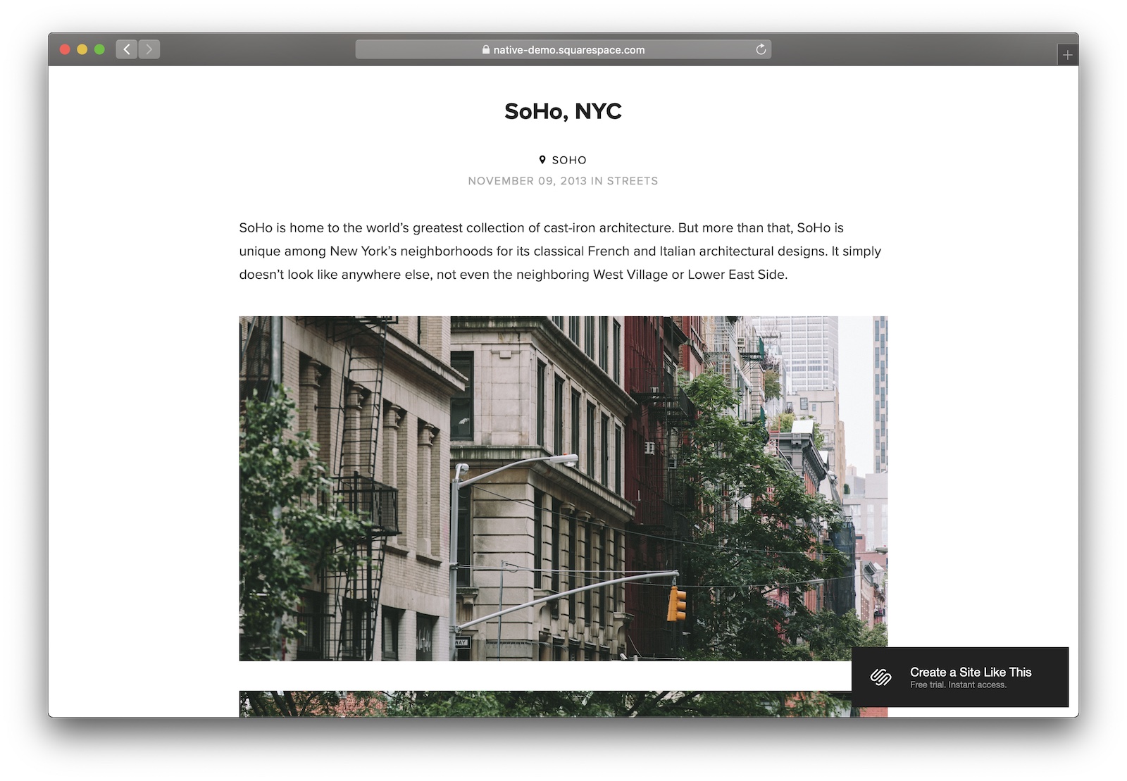
Simple flexibility gives Native the third spot. If you want to get blogging quickly, go with Native.
Designer Notes

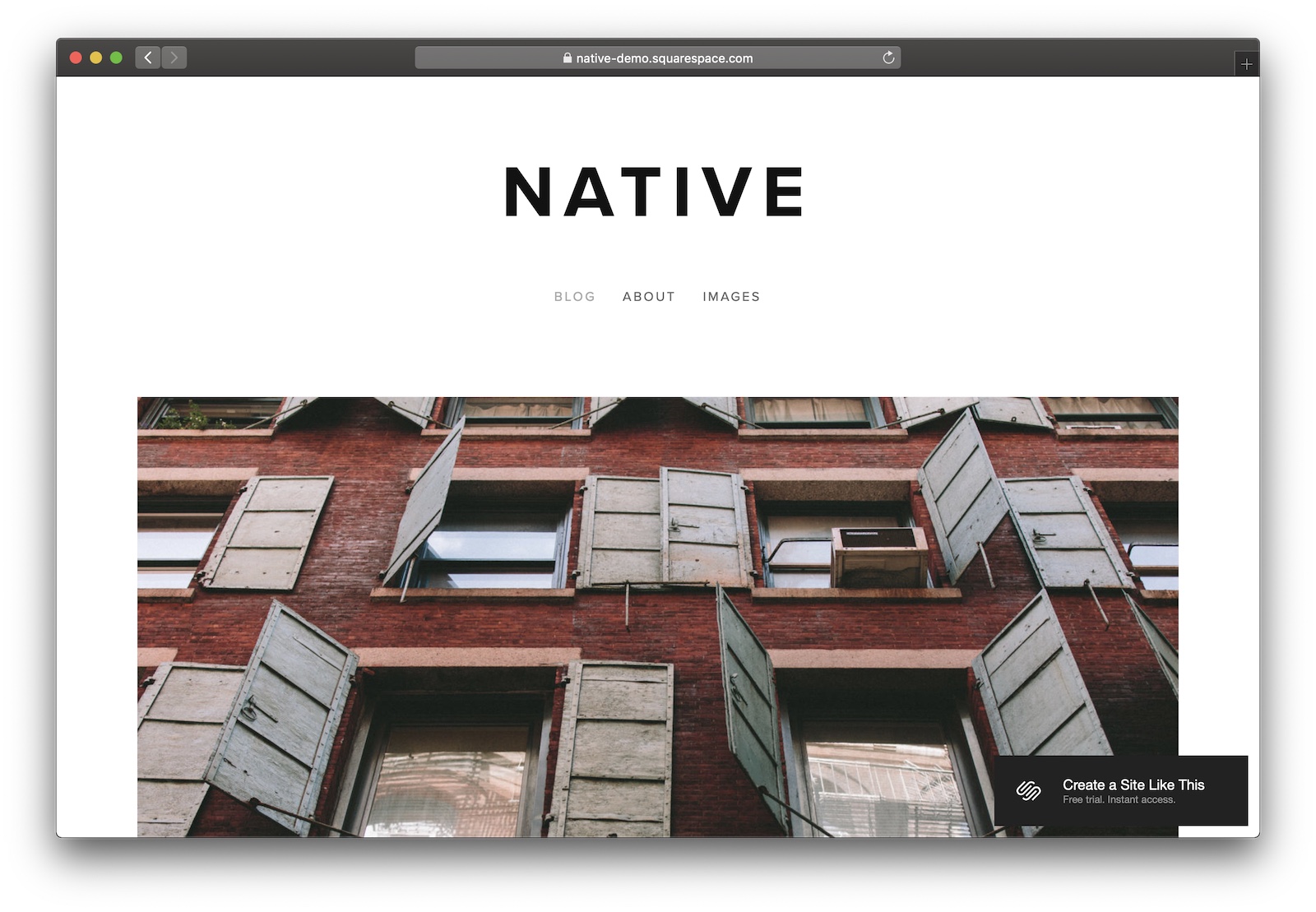
  • Native has a simple one-column layout without any bells and whistles. It’s a particularly good choice for personal blogs.
  • The typography is nice – boring, but nice. No one’s going to complain about your font or have trouble reading your site.
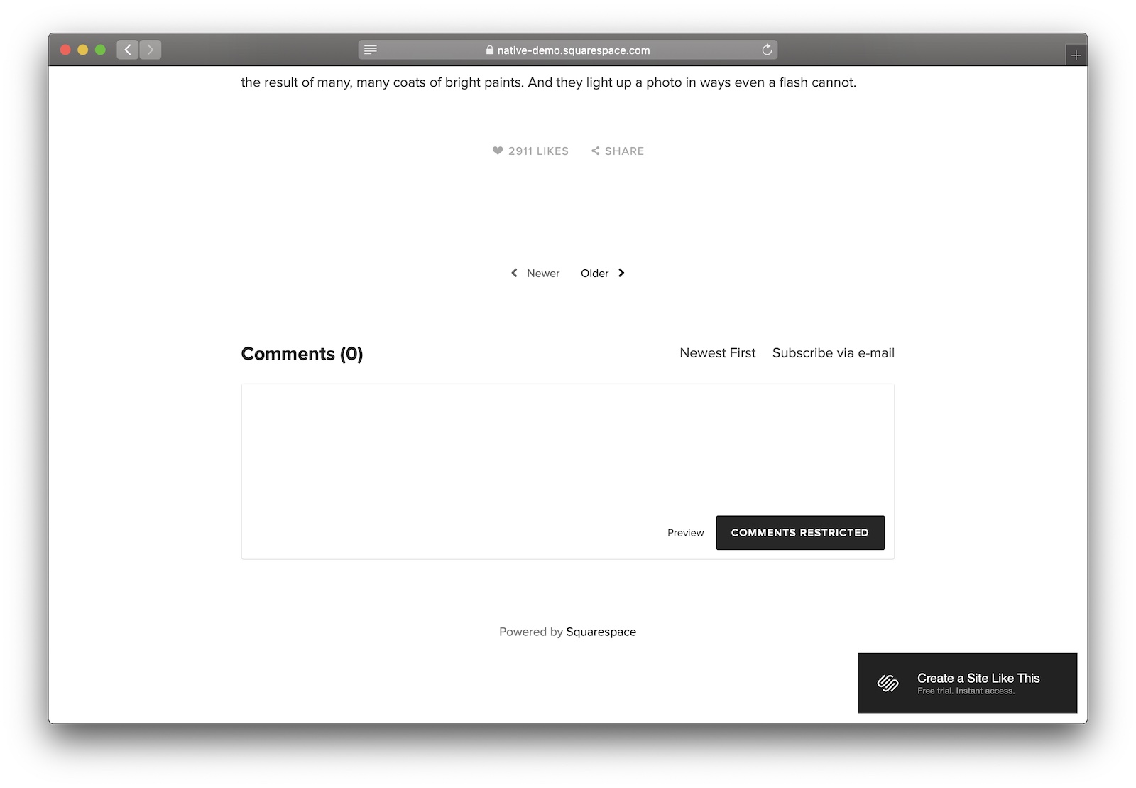
  • Comments, likes, sharing widgets, and email subscription links get slotted in neatly at the end of your posts.

What’s the best Squarespace template for businesses?

#1 Stella

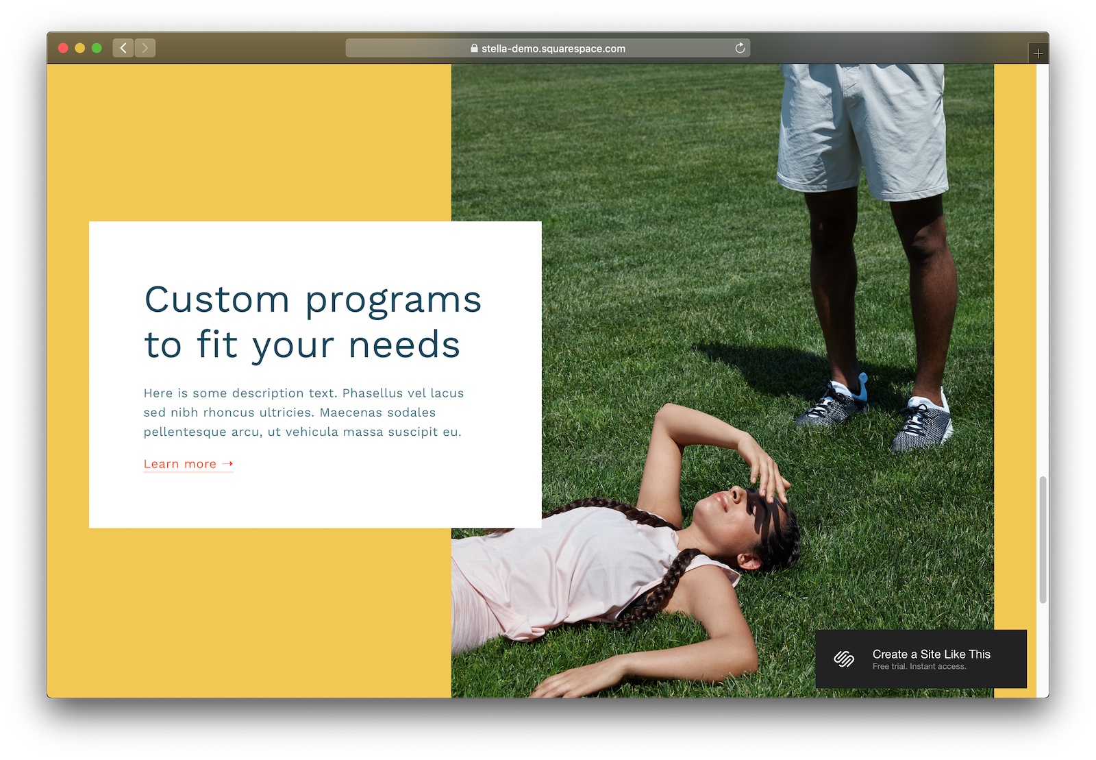
Ooh boy, if you’re a modern business with the brand to pull off Stella… go for it!
Designer Notes

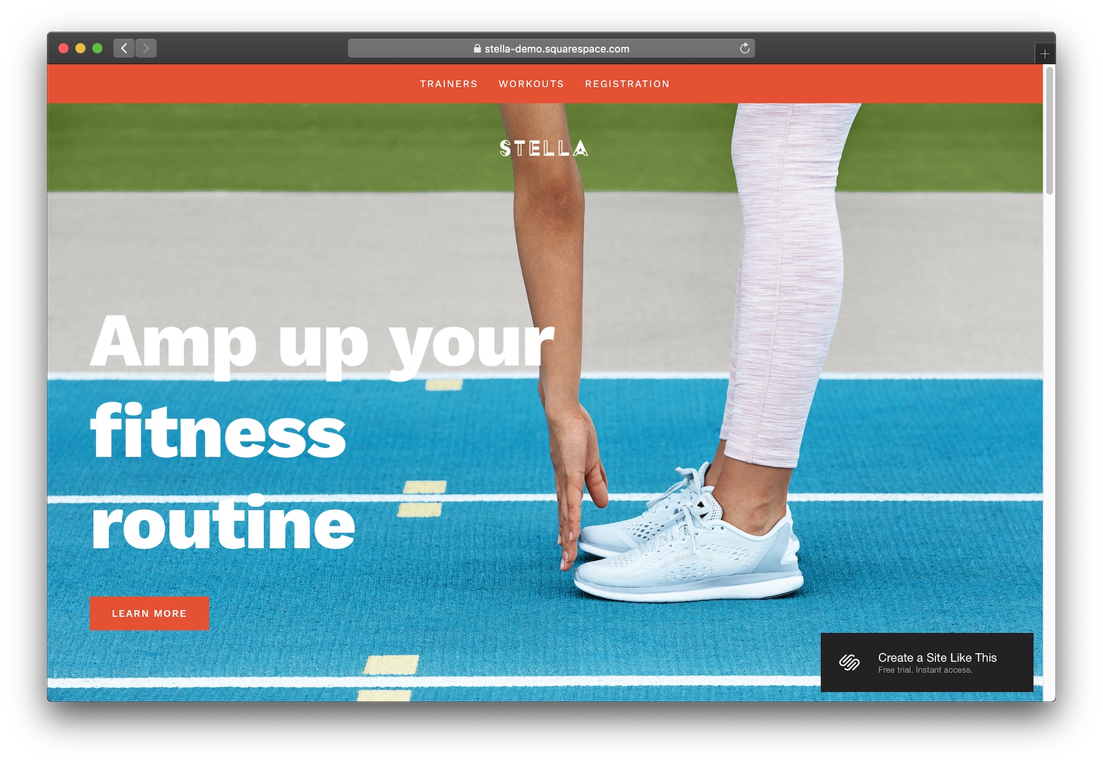
  • I absolutely love Stella. Modern graphic design, a beautiful typeface, and high-contrast navigation make for a fresh, contemporary template. If you’ve got a modern business and photography to back it up, Stella’s going to be a great option.
  • High-contrast colours really capture your customers’ attention.
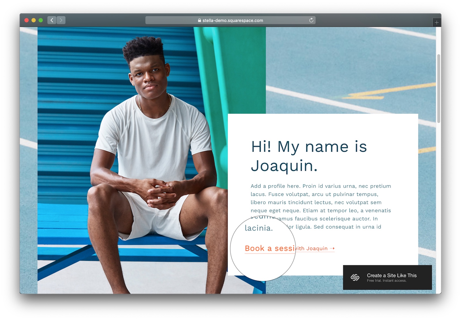
  • Love the styling on these call-to-action links as well, really makes them stand out and be extra clickable.

#2 Harris

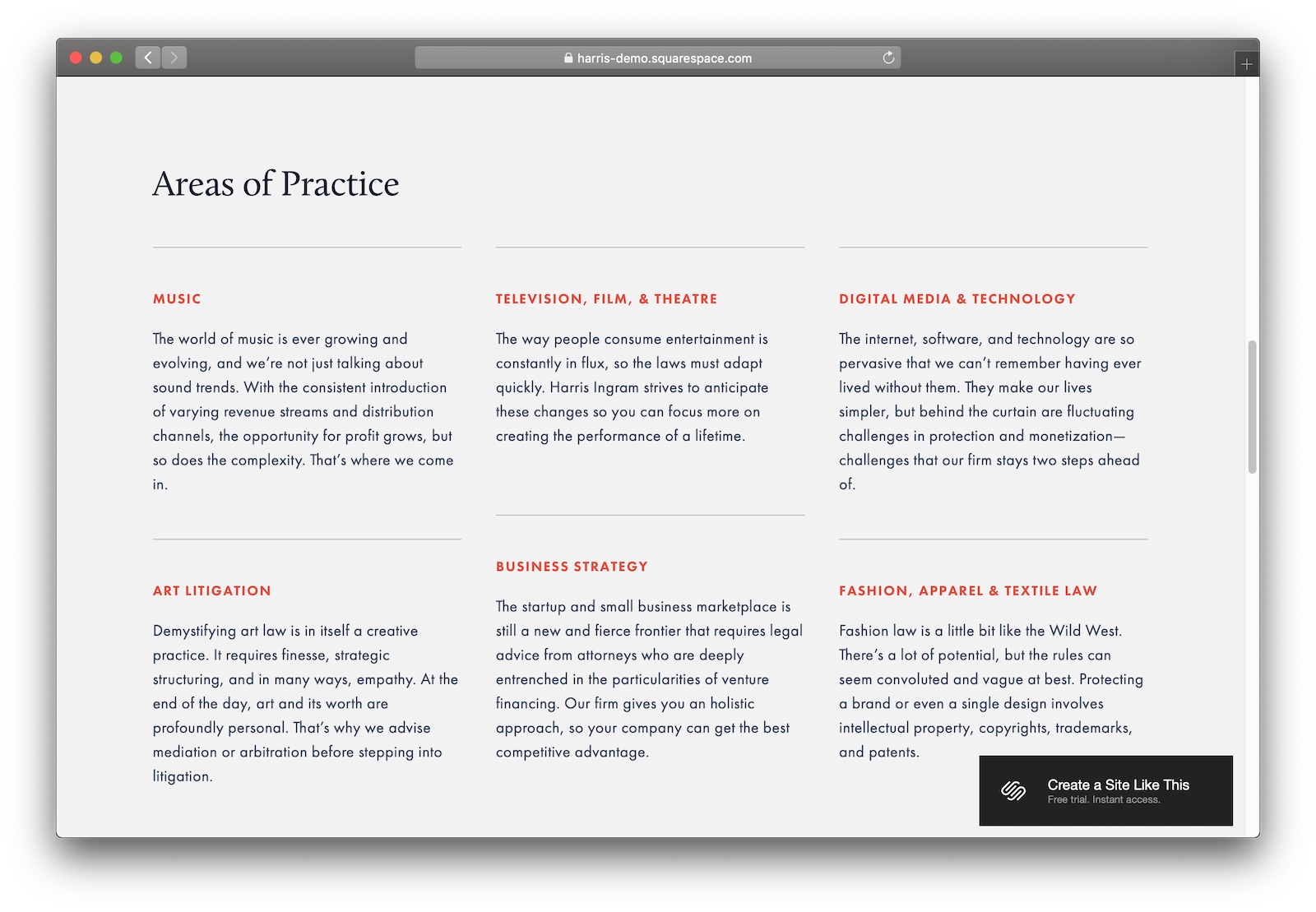
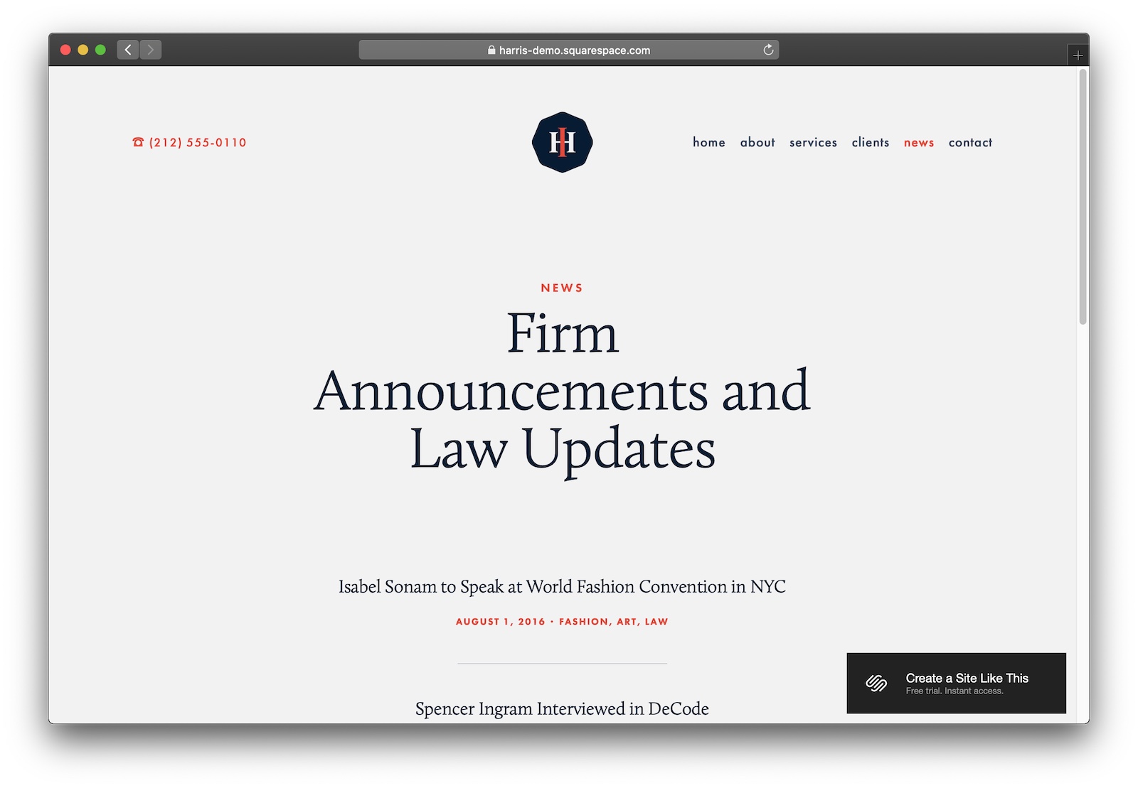
Got a more traditional business? Harris is like the Powerpoint template of Squarespace themes.
Designer Notes

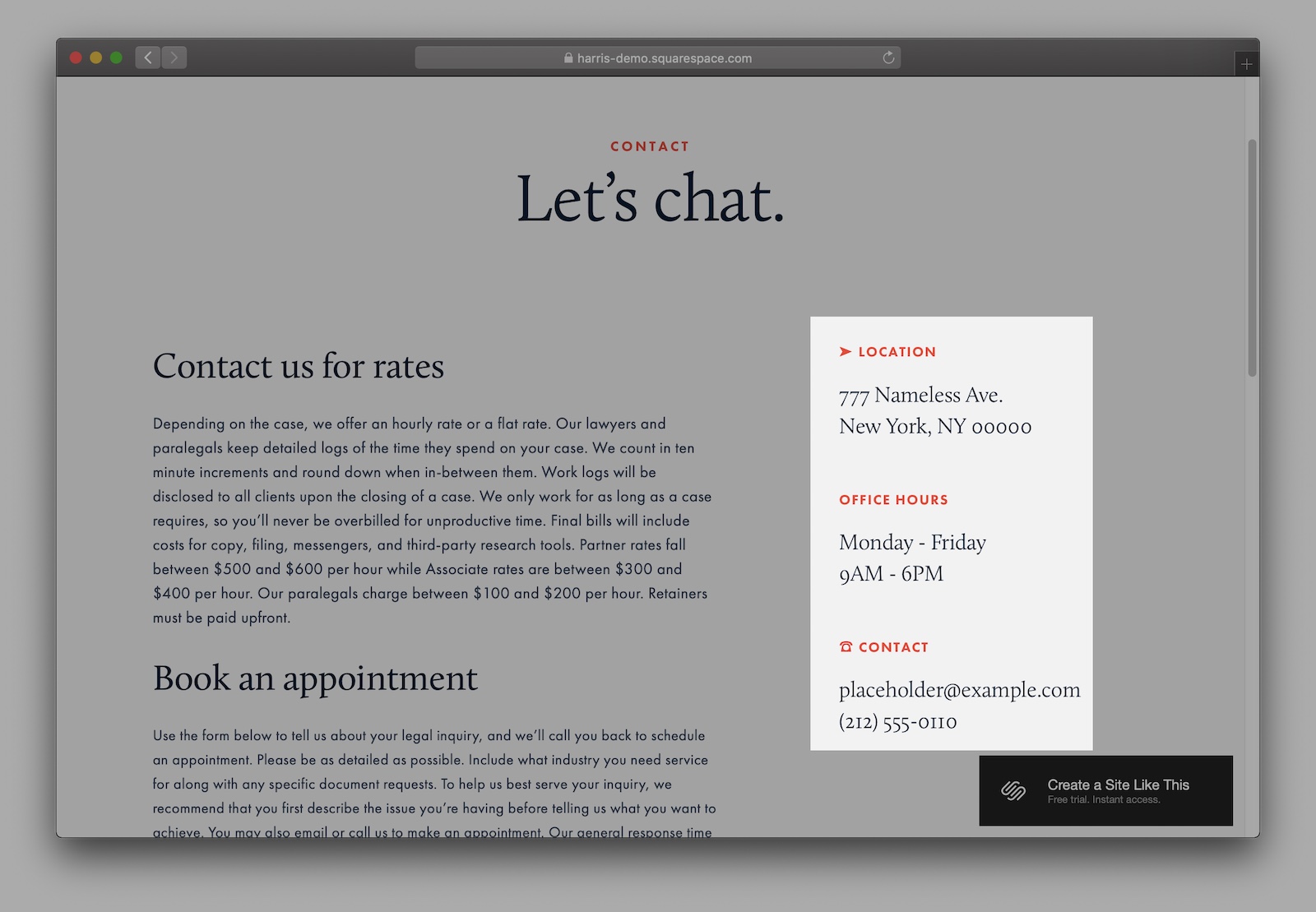
  • Harris is nice – no doubt that it’s plain and has some strong Microsoft-y vibes. But that’s not a bad thing. If you’ve got a long-running business or you want to communicate ultimate professionalism, go with Harris.
  • A couple of killer SEO features here – callouts for addresses and contact details, a blog, and solid sitemap structure mean that Google will love you.

What’s the best Squarespace template for eCommerce online stores?

#1 Jones & Indigo

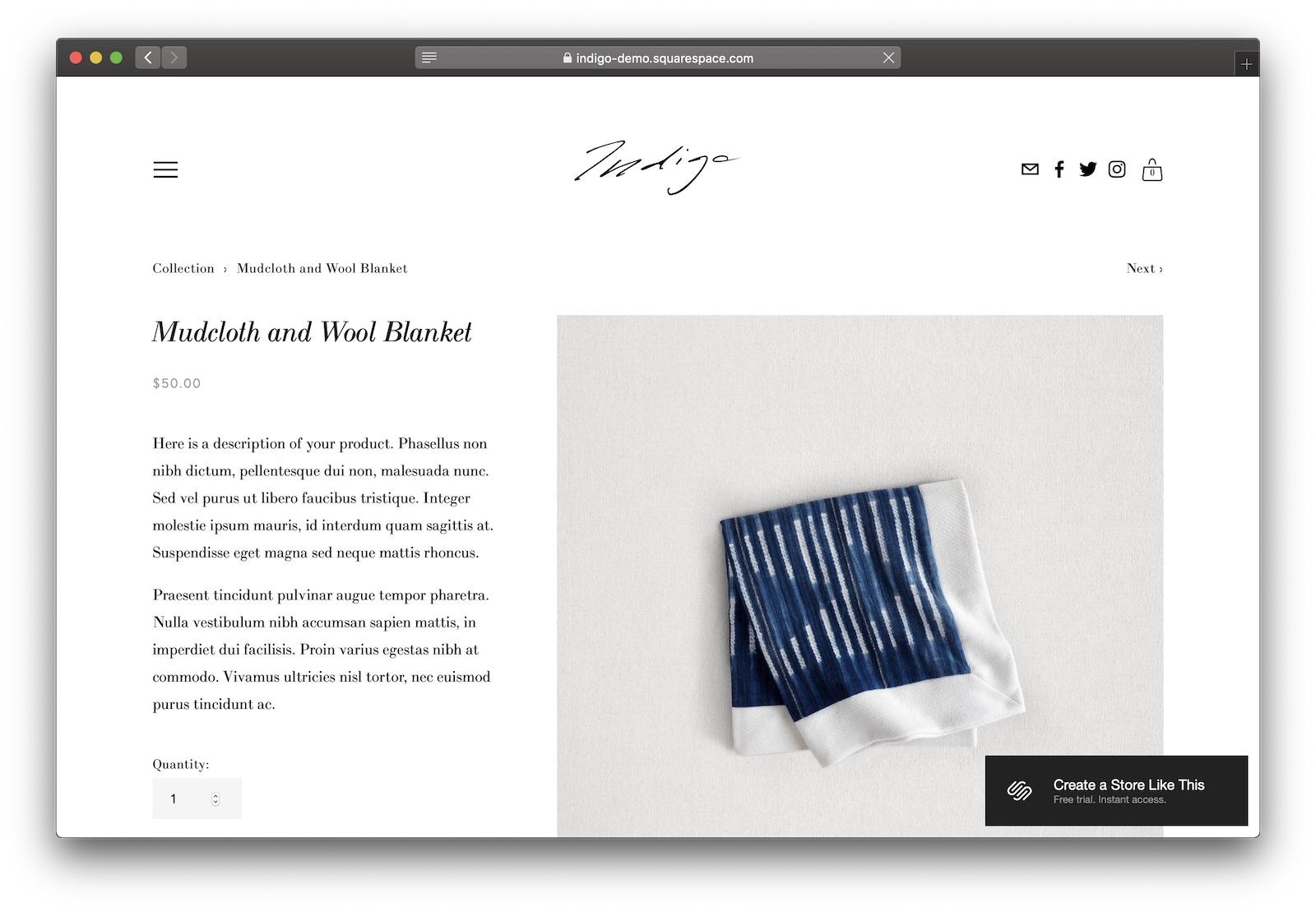
Jones & Indigo are two comparable templates that’ll get you started selling online.
Designer Notes

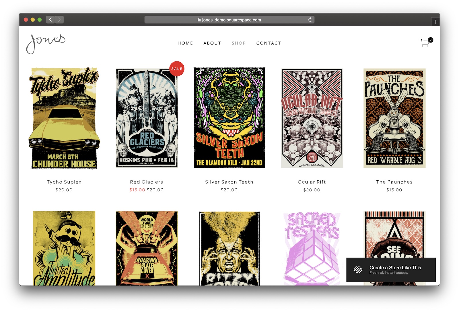
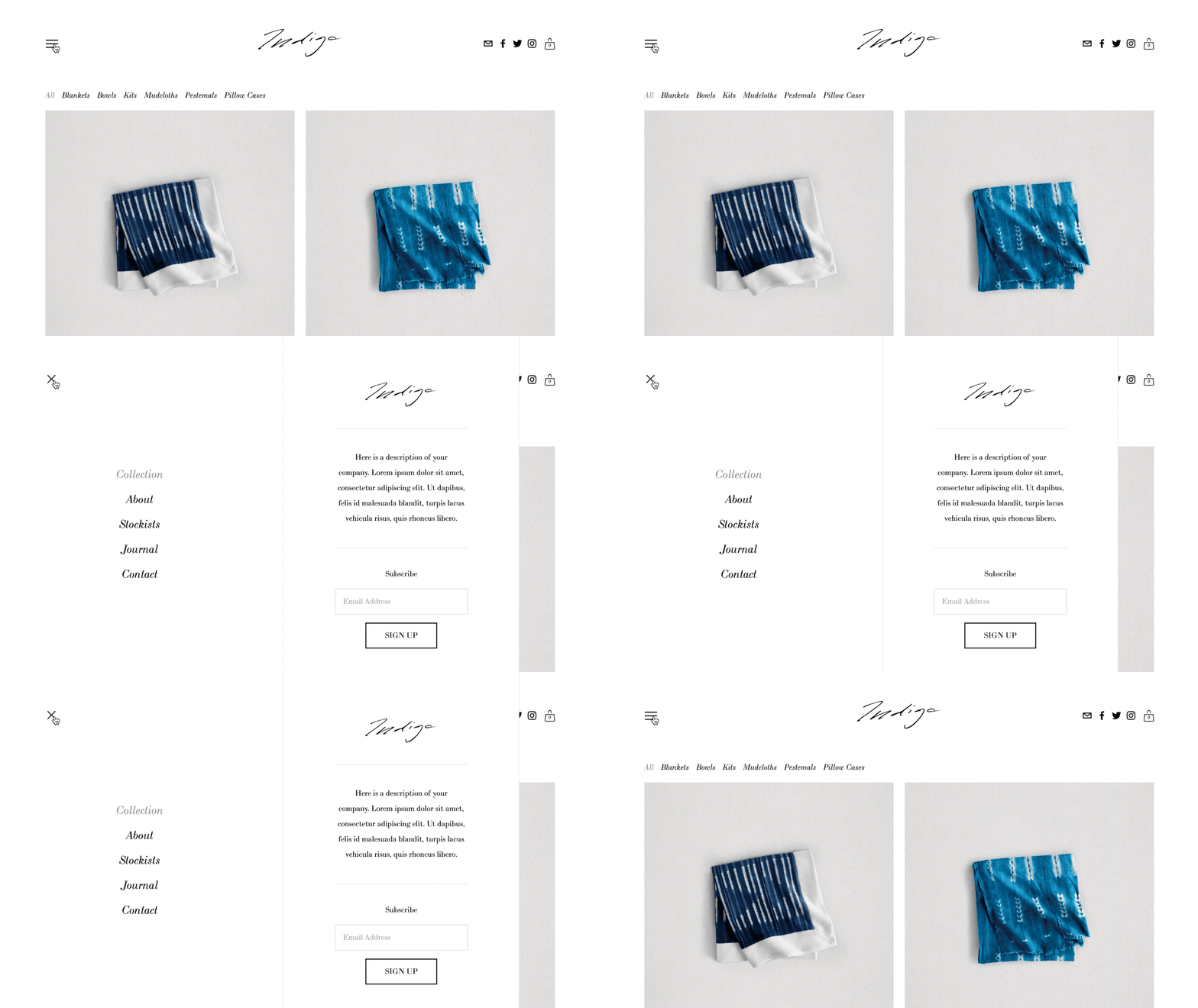
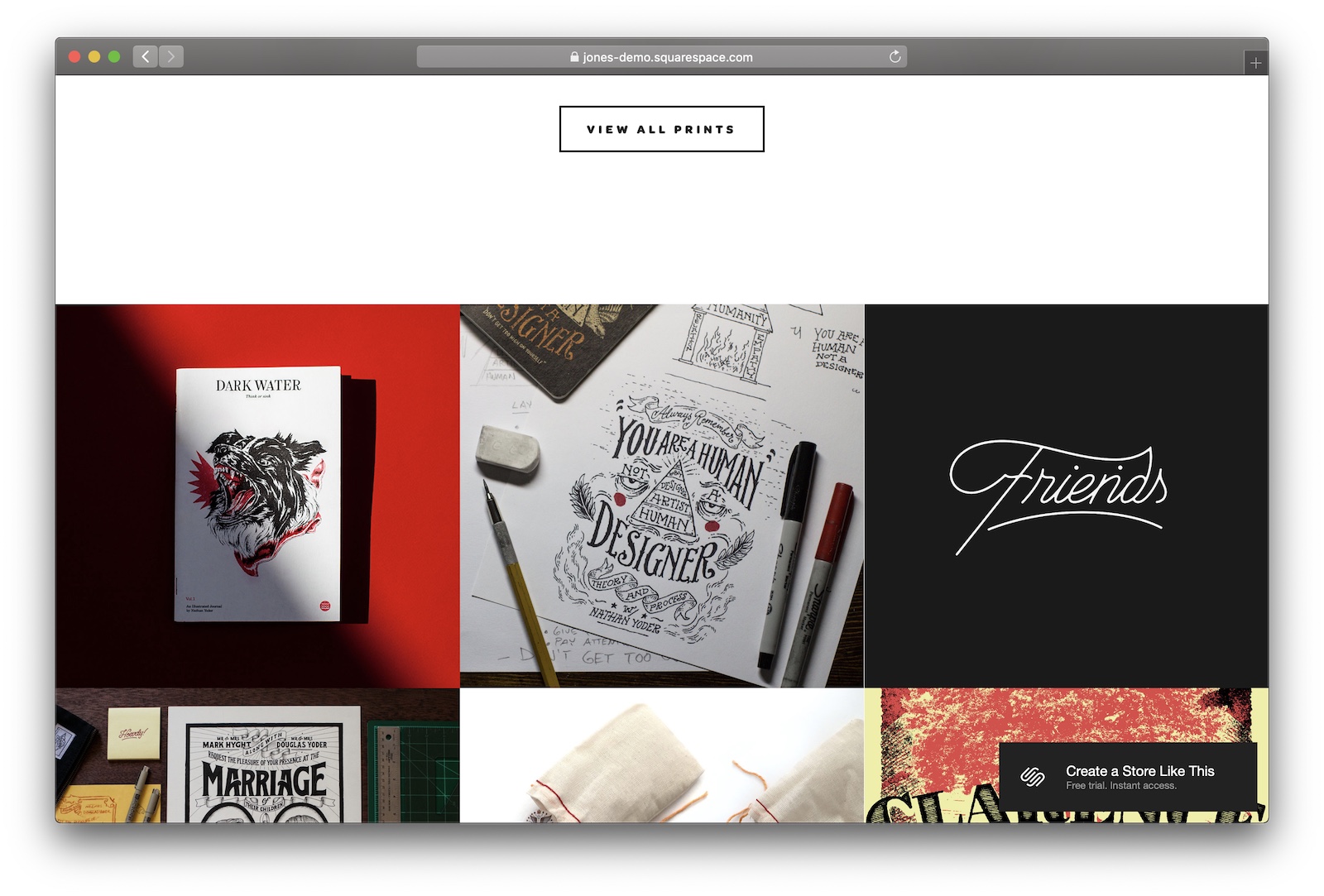
  • Jones & Indigo are two templates well-suited to independent online stores. They’re both full-featured and have customizable layouts. If what you’re selling is more modern or digital, head towards Jones. For hand-crafted products, use Indigo.
  • The biggest difference between the two is Indigo’s hamburger navigation.
  • Jones features a nice tile collage on the homepage to highlight your products.

#2 Marta

If you’ve got the product photography to pull it off, Marta is a gorgeous eCommerce template.

Designer Notes

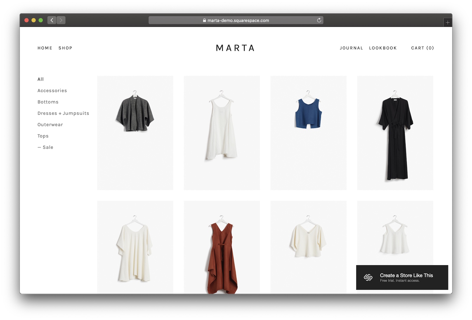
  • Marta would’ve been my first pick except for the fact that it requires some pretty killer product photography to look good. Great for high-end products and fashion.
  • It’s got great typography, eye-catching pages you can use to explain your product’s backstory, and great buttons.
  • My favourite thing about Marta is that it lets you navigate by category. Such a simple thing, but if you’re offering a lot of products, your customers will thank you (by buying stuff).

#3 Brine

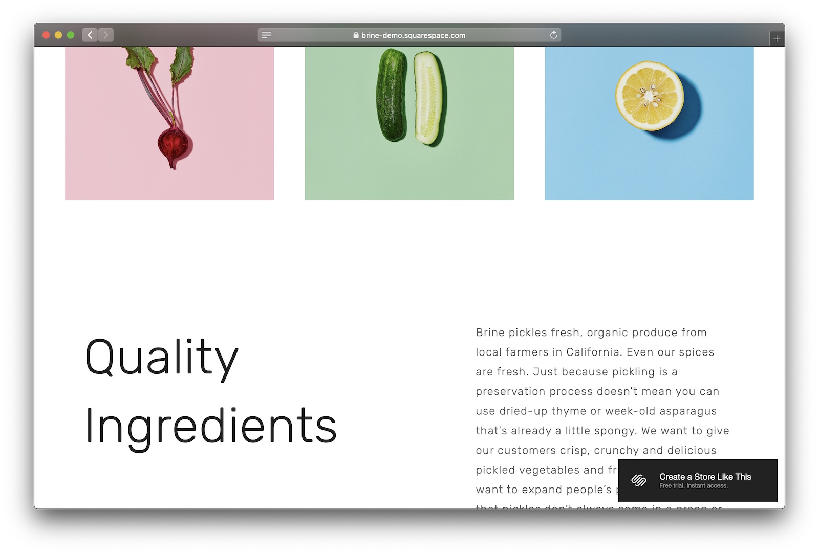
Brine’s a great theme for modern subscription and service businesses.
Designer Notes

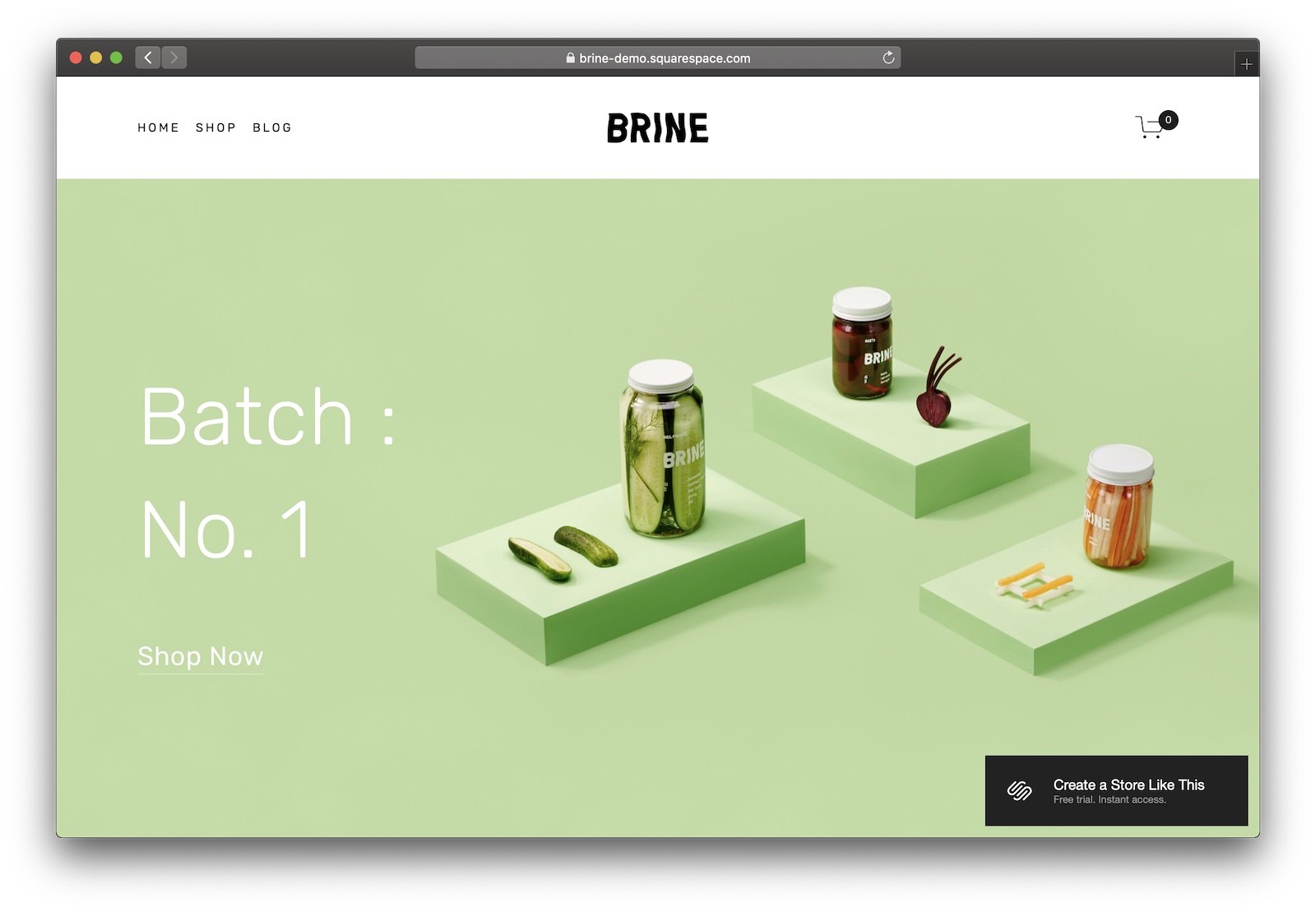
  • Brine is great theme for any business with a modern edge – whether it’s a subscription box or a product marketed to millennials.
  • Ample space to slot in text to explain how your service works, what makes your product unique, and how you can give your customers what they want. Get your copywriting going!
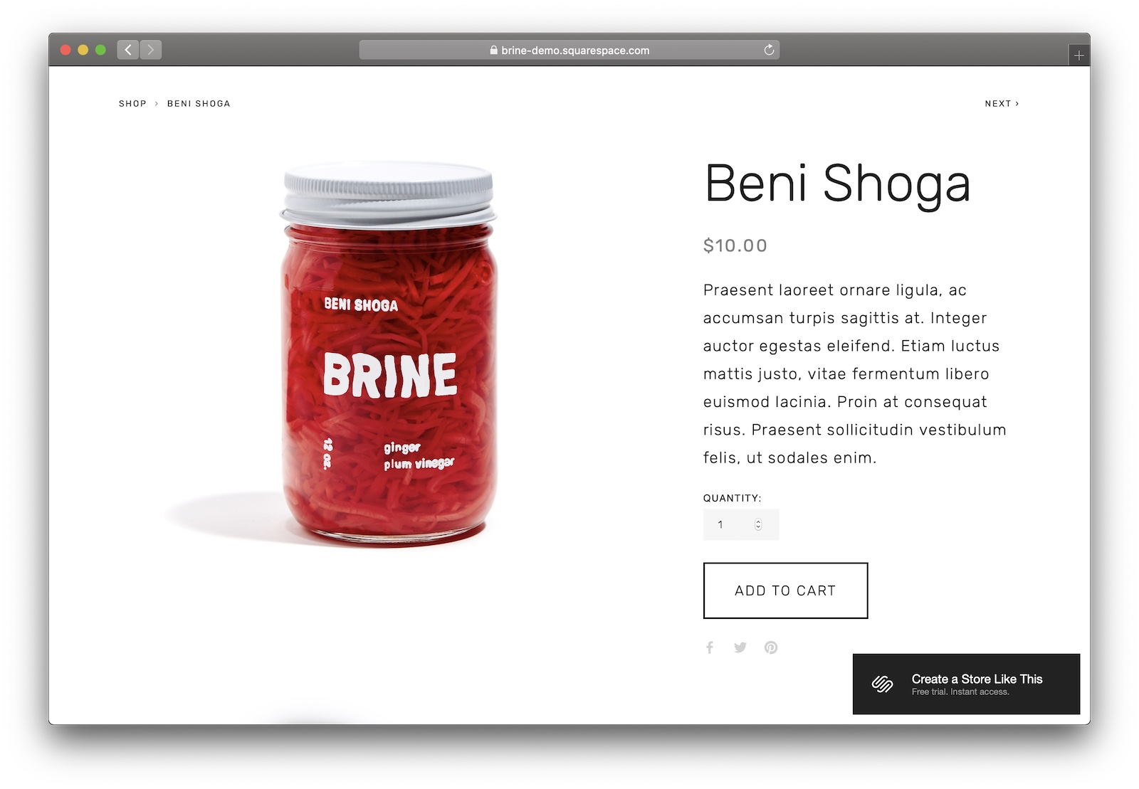
  • Simple product pages mean that impactful photography are key to keeping your conversion rate high.

Which Squarespace templates are best optimized for SEO?

Unlike the other categories, choosing the right template for prioritising SEO is less visual, more structural.

You need to focus on your site’s organisation, metadata, and content.

In fact, most Squarespace templates have great SEO right out of the box – you can really use any of them.

(But I’ve included my top picks below anyway.)

When you’re thinking about Squarespace SEO,

With that in mind, here are my top picks for templates when SEO matters.
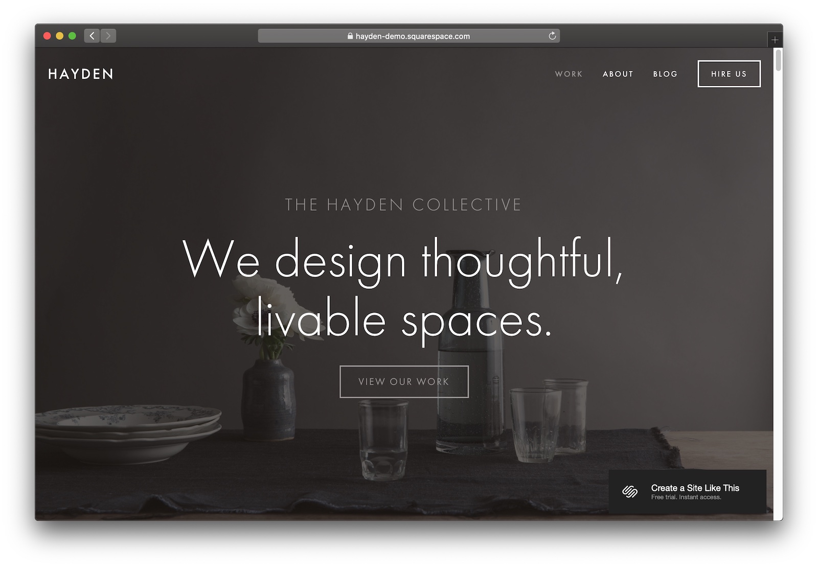
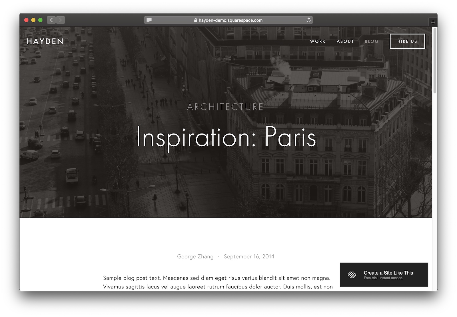
#1 Hayden

Hayden is a near-perfect SEO-optimized general purpose template for Squarespace.
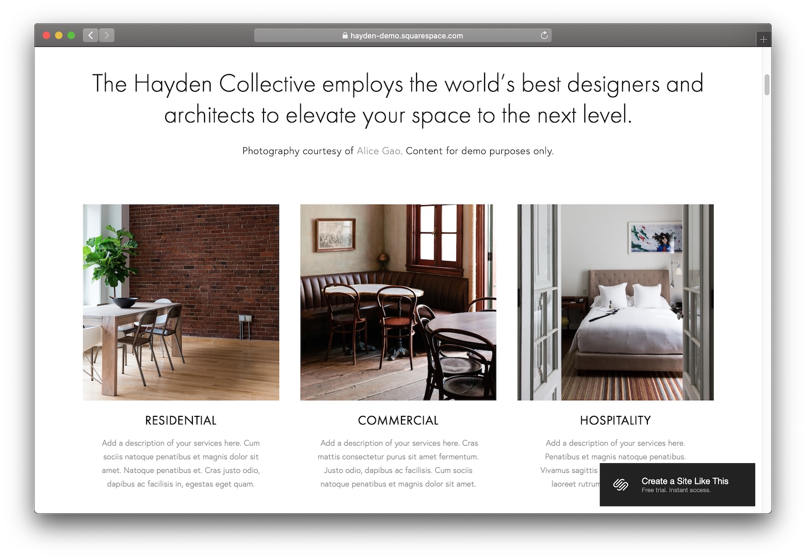
Designer Notes

  • Hayden’s such a classic Squarespace theme – you can’t go wrong choosing it.
  • Plenty of space on the home page and content pages for detailed, juicy-for-search copywriting.
  • A blog with prominent category pages are great for showcasing your site’s structure to Google.

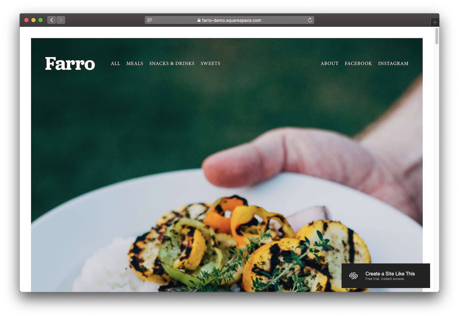
#2 Farro

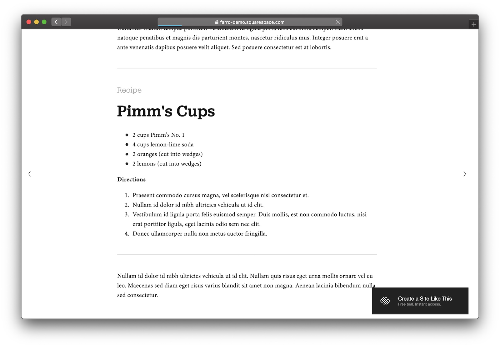
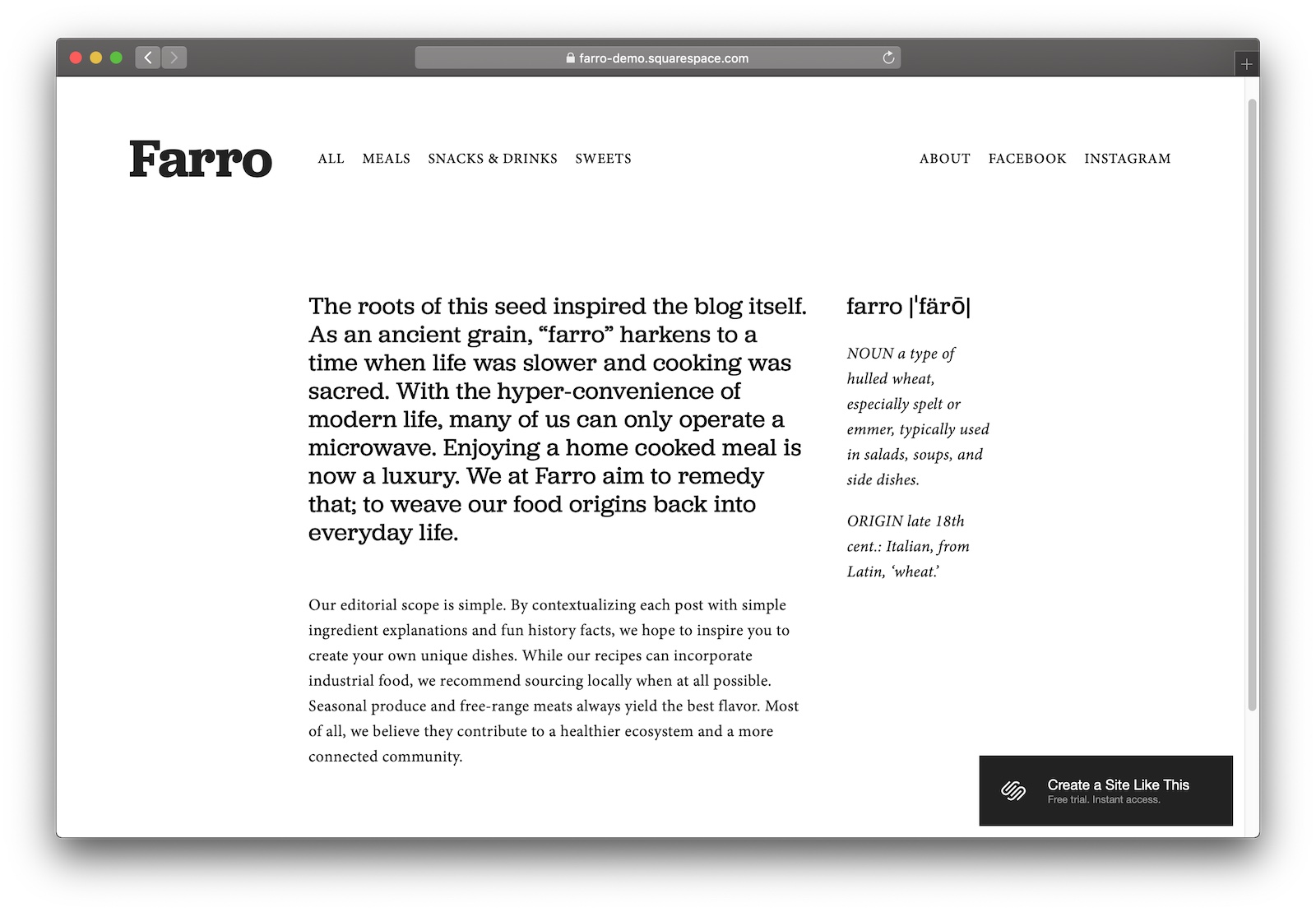
Farro’s rich structure and pull-out content mean you’ll shoot up the rankings. Great for photo-heavy sites.
Designer Notes

  • On a visual note, I like the white frame around the hero image. Really helps with the high-quality magazine aesthetic throughout the theme.
  • Callout content – like you see here with the recipe – is so sweet for Google. They pick out the structured data and surface it right at the top of people’s search results.
  • Farro requires a lot of text to look great and function properly. If you’re making a newsletter, recipe site, or anything that’s got a mix of text and images, Farro’s a nice fit.

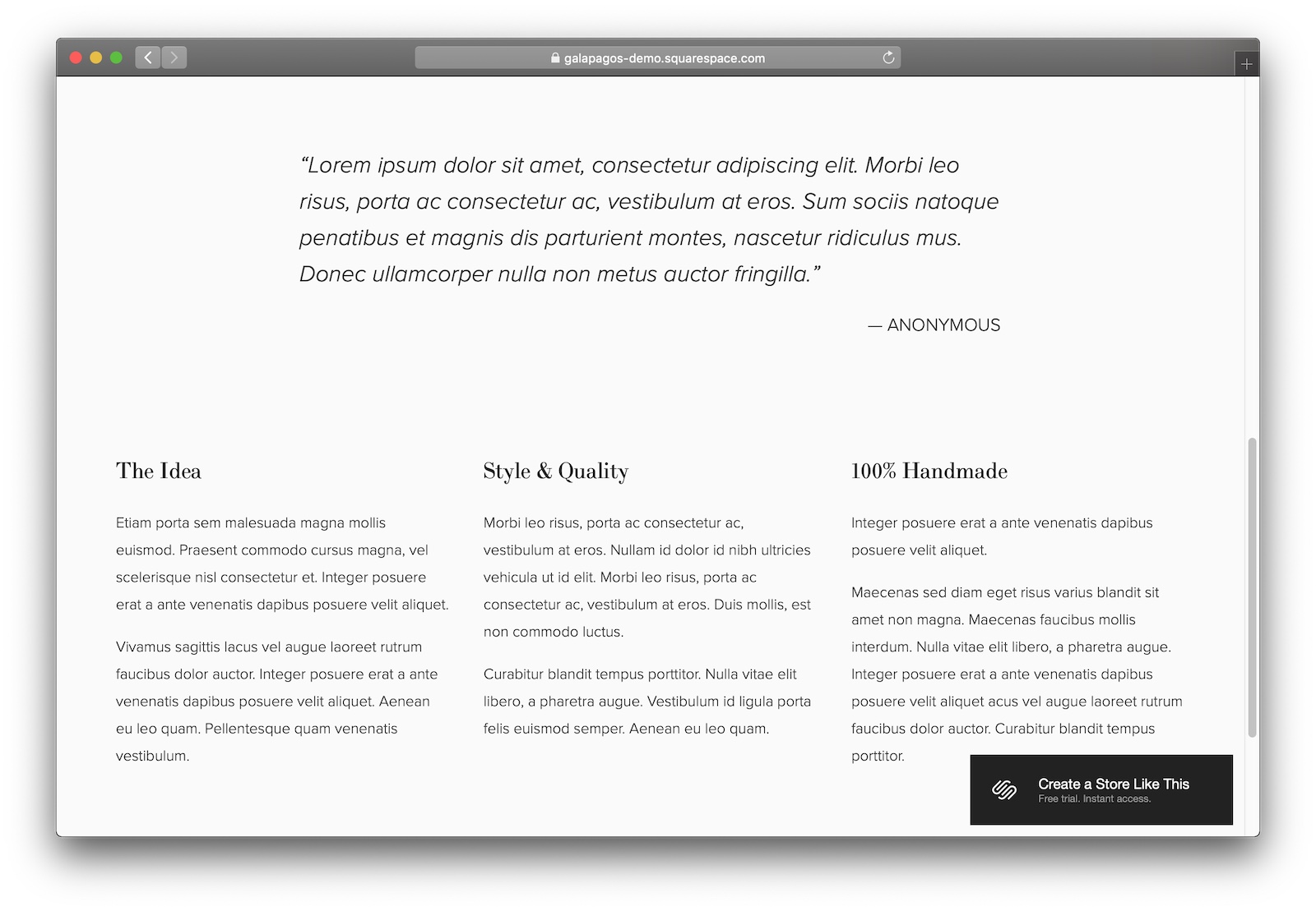
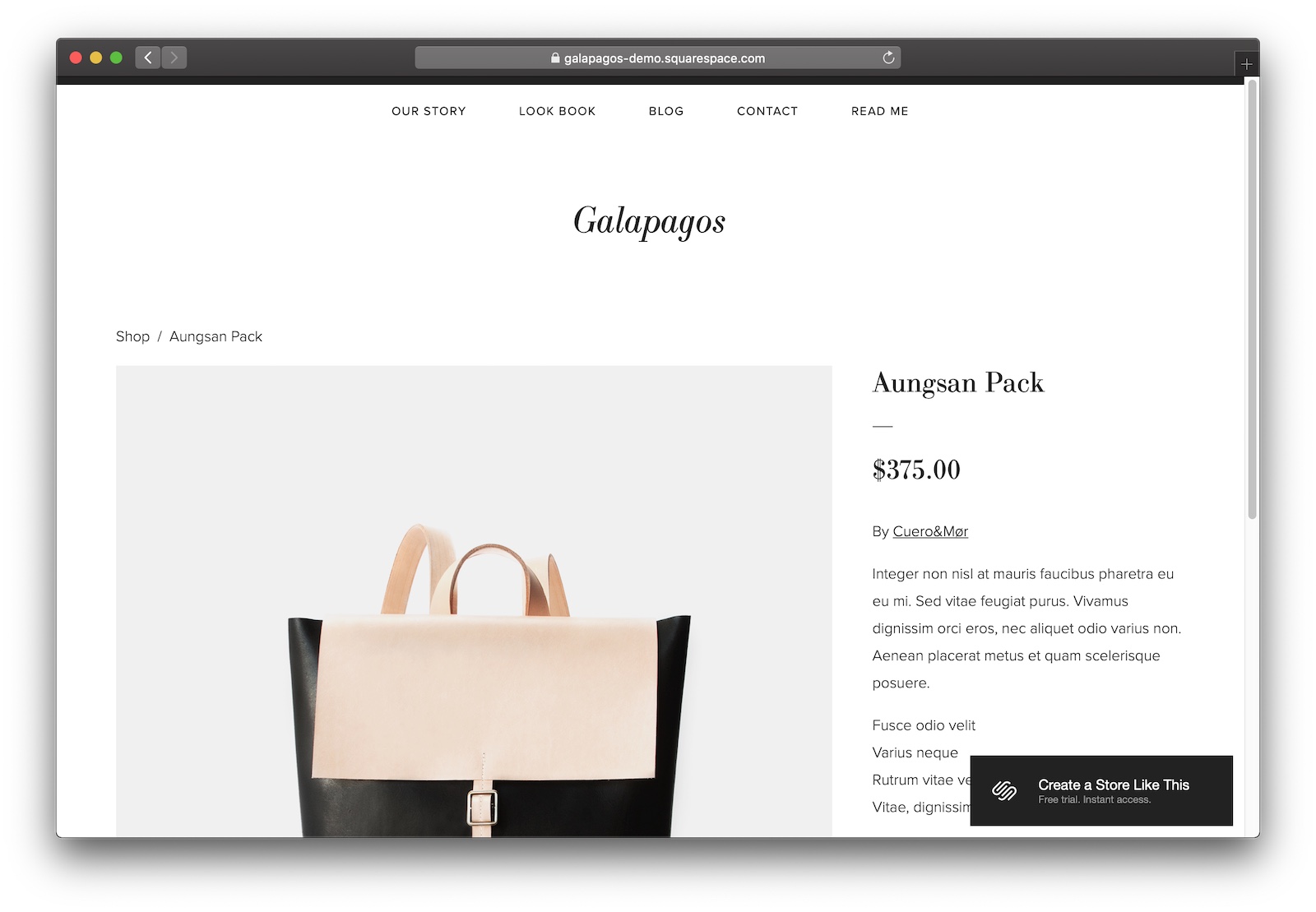
#3 Galapagos

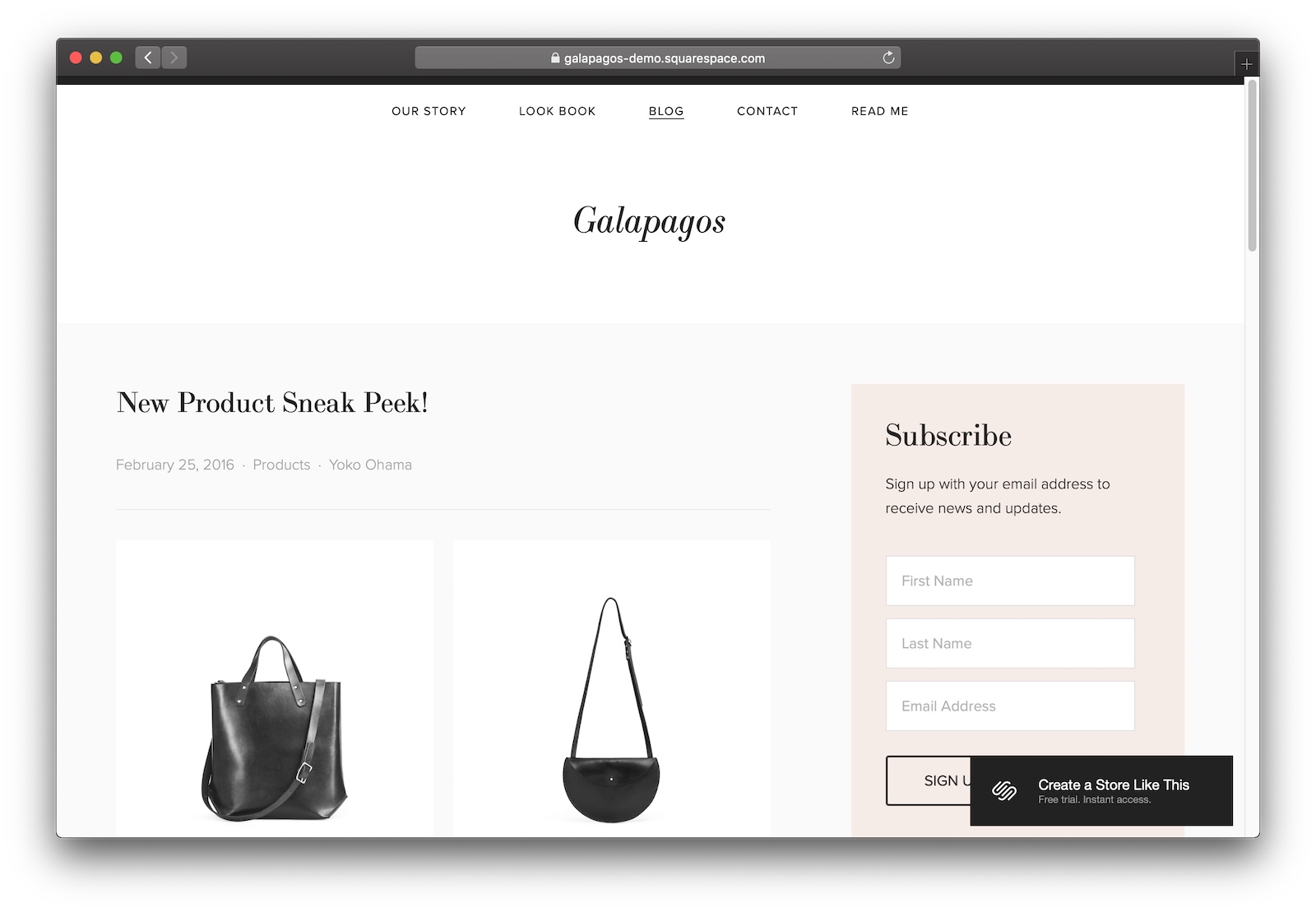
Galapagos is the best eCommerce template with great SEO optimization.
Designer Notes

  • Comes with a blog by default. Including a blog on your site – particularly for online stores – is going to be a huge win for your search ranking. Just gotta keep it up to date!
  • Plenty of space for search-friendly copy and explaining your store’s ethos to potential customers.
  • Google’s started pulling out key product data in search results, so having a well-structured product page – like you’ll get with Galapagos – is key.

What’s the best Squarespace template for videographers and filmmakers?

#1 Wexley

Wexley makes a killer video portfolio site with a gallery and full-screen carousel.

Designer Notes

  • I mentioned Wexley in my section on templates for photographers, so it’s no surprise that this template makes a return for videos.
  • The full-screen carousel is particularly good for filmmakers who wan’t their videos to take centre stage.
  • Wexley’s an all-around great template – if you’re a videographer looking for a minimalist template to show off your video portfolio, try it out.

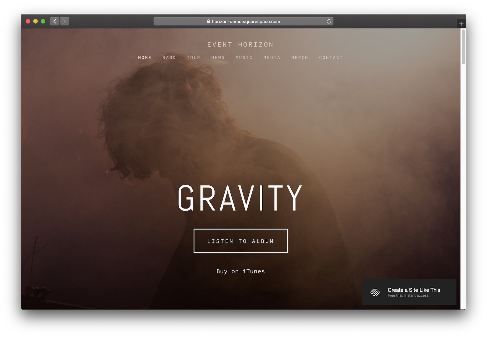
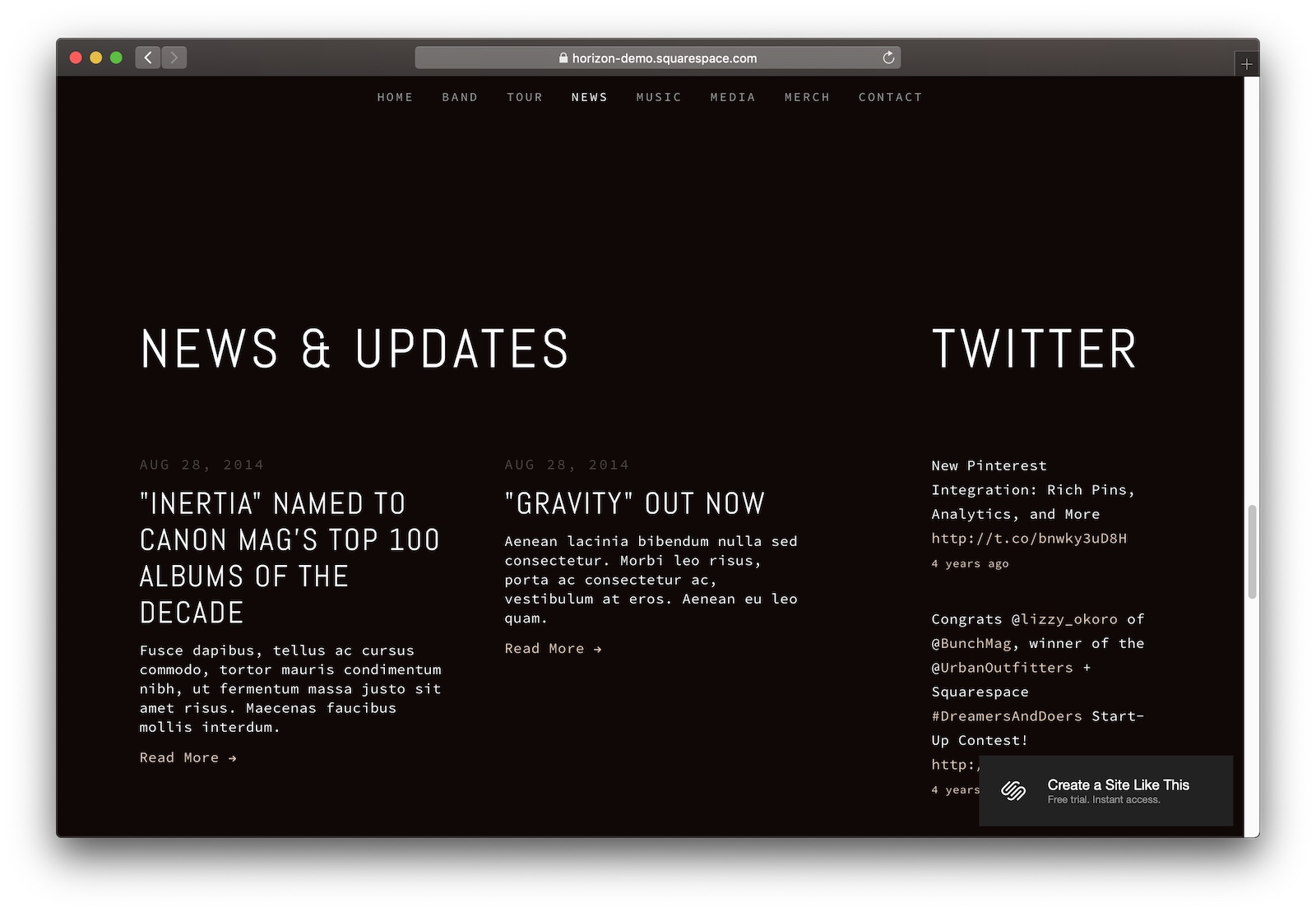
#2 Gravity

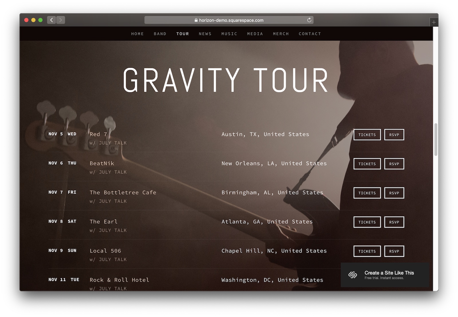
Originally designed for touring bands, Gravity adapts well to films and videos.
Designer Notes

  • In the previews, you’ll see that Gravity looks like it’ll work best for bands. But don’t let that dissuade you. With a bit of tweaking, Gravity can make for the perfect template for sharing your short film.
  • Having a few screenings of your film? Gravity comes with a beautiful little tour date widget where you can plug in your showtimes.
  • It does a good job of balancing the important stuff (the videos) while also giving you space to include details and updates for your audience.

What’s the best Squarespace template to showcase your portfolio?

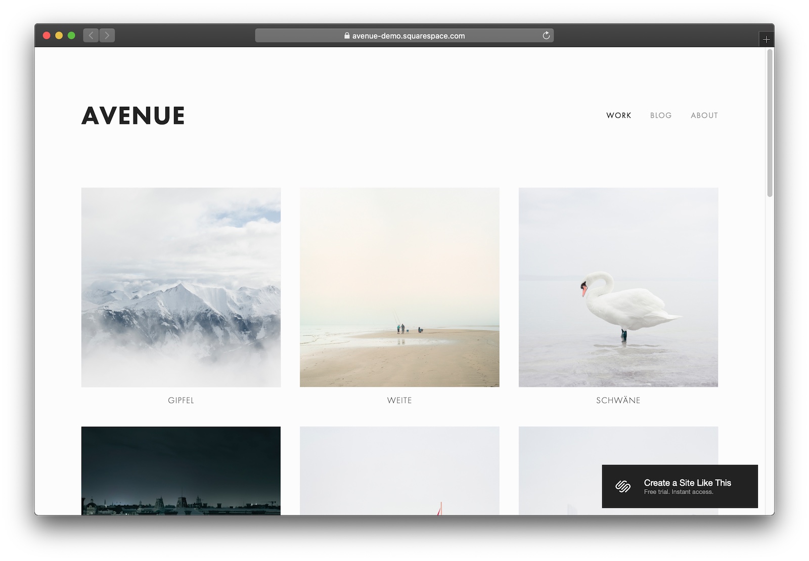
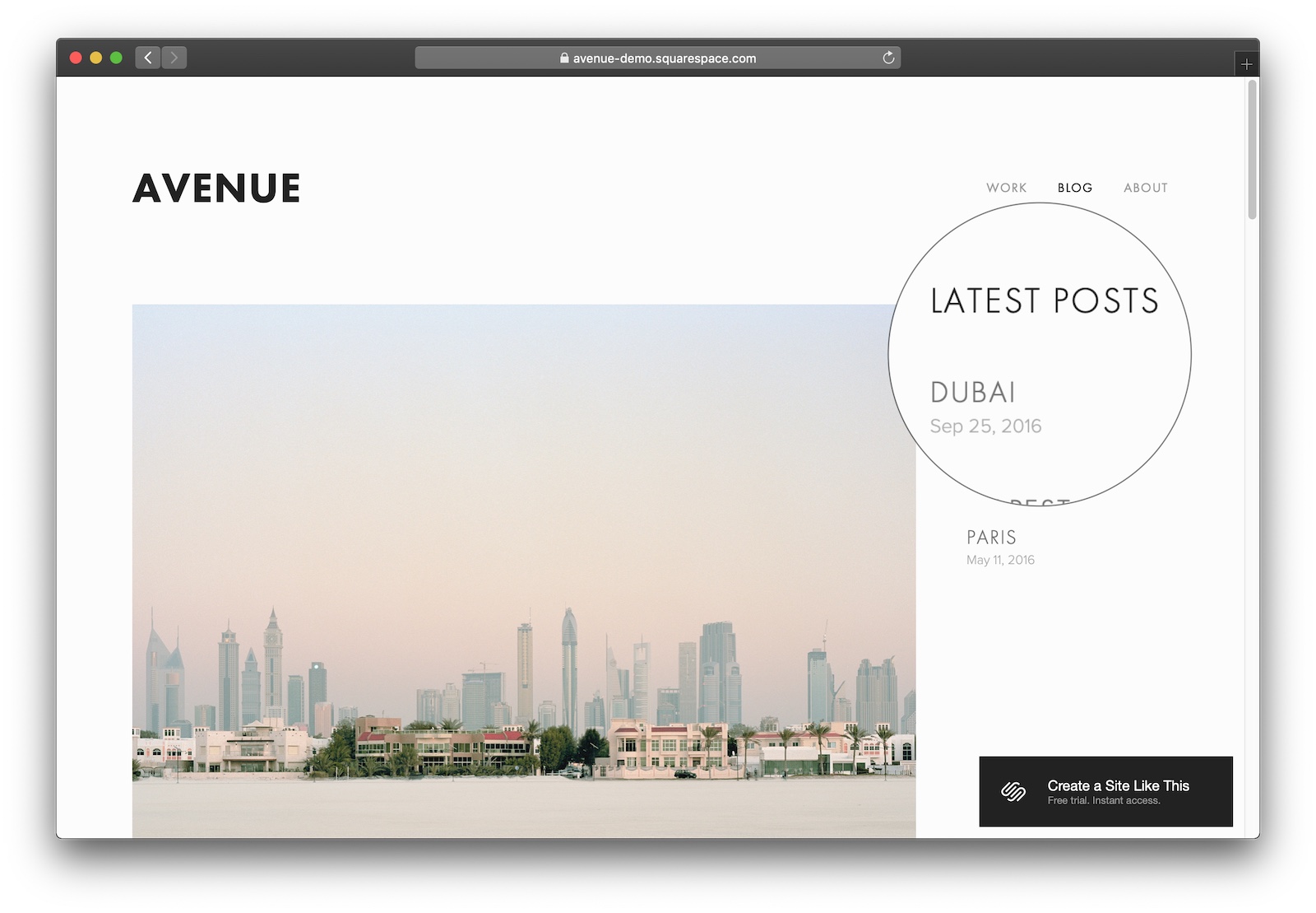
#1 Avenue

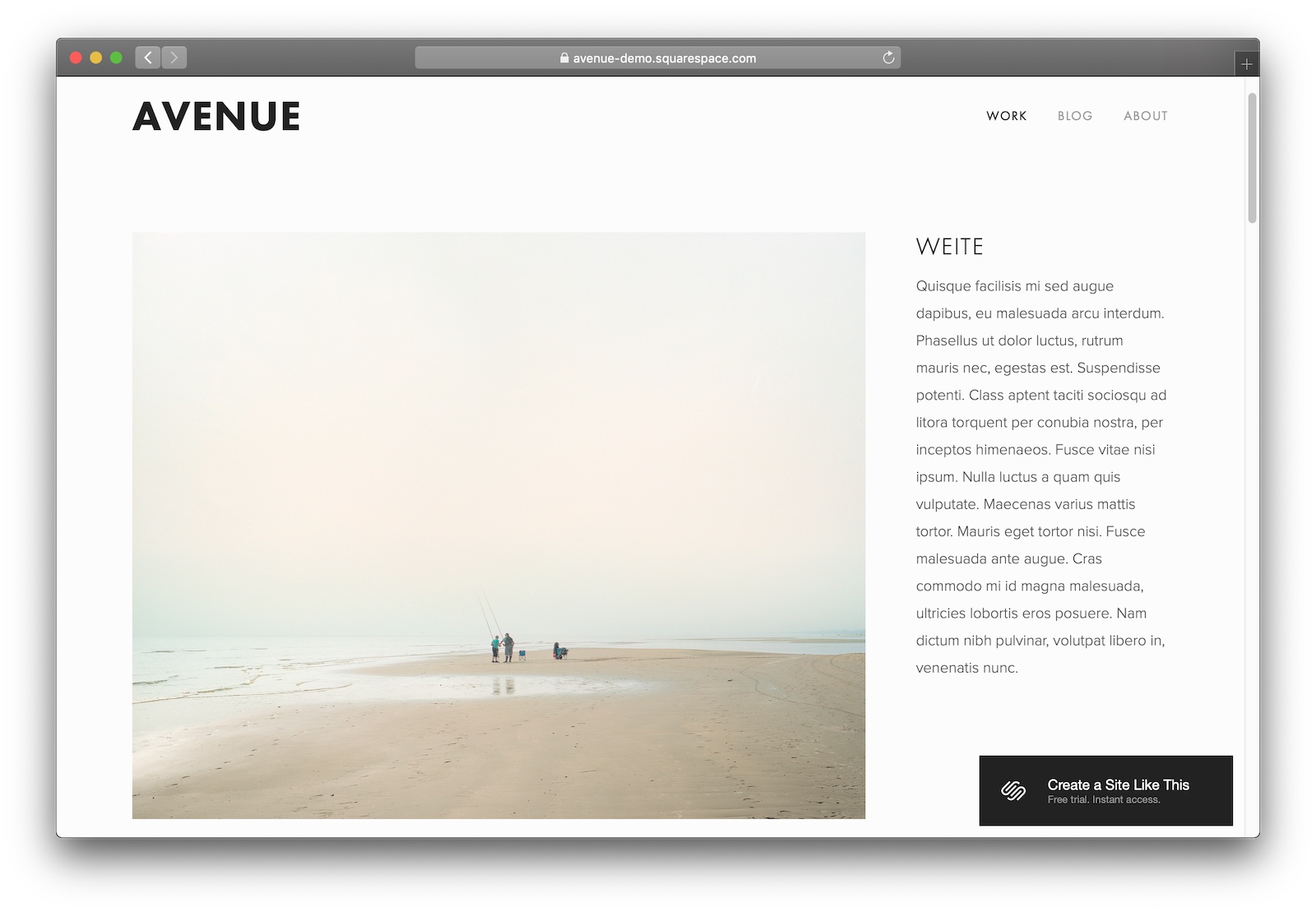
A classic minimalist template that’s perfect for any type of visual portfolio.
Designer Notes

  • Avenue’s one of those templates that’s good because it disappears. It’s got this elegance through simplicity – which is exactly what you want for your portfolio. It just gets people onto your site, lets them click what they want, and gets them reading about it. Simple, right?
  • I really like the inclusion of a blog for boosting your portfolio’s ranking in Google. Plus, the right-hand-side navigation that Avenue uses on blog posts is just different enough to stand out.

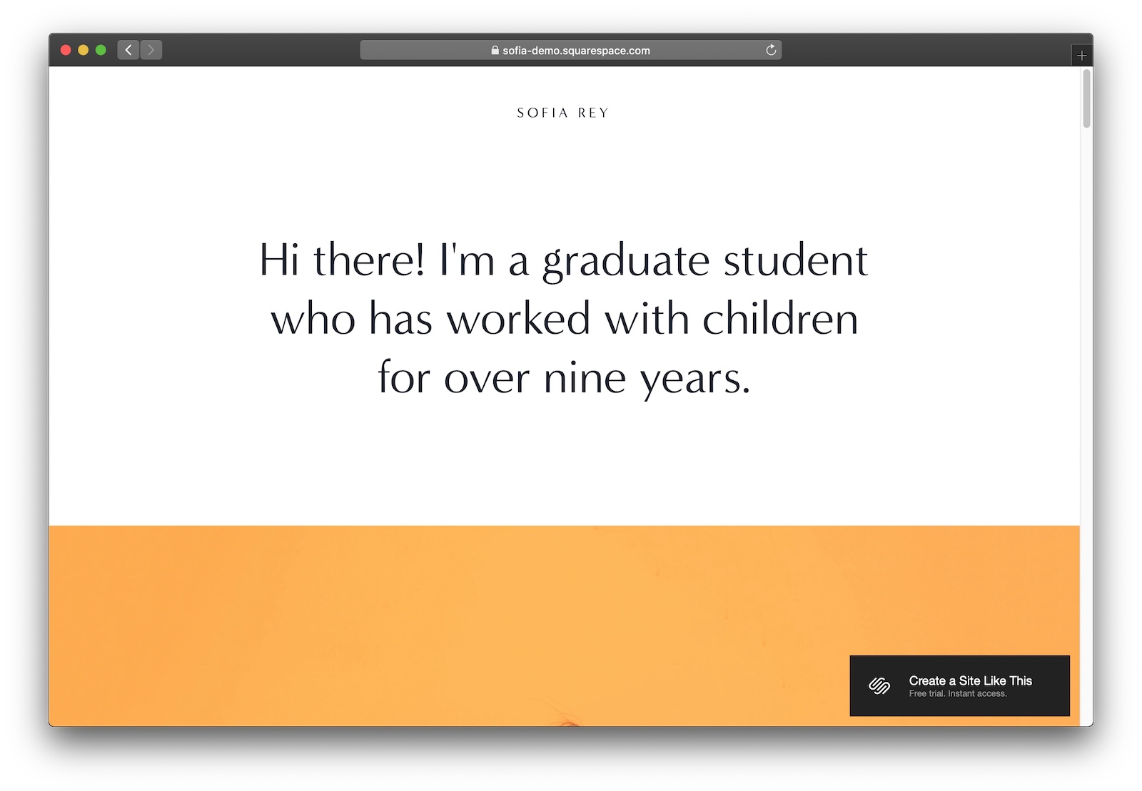
#2 Sofia

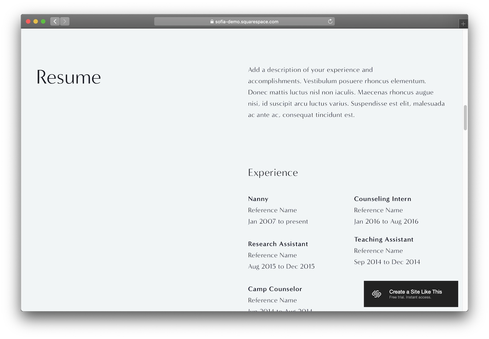
Just starting to fill your portfolio? Go with Sofia’s simple one-page layout.
Designer Notes

  • Sofia makes it easy to communicate what’s important about you. And to make sure your message gets heard in the right way.
  • Really like the one-page layout that Sofia starts you off with. It forces you to focus on the work – and the artist – in the portfolio. There’s less website junk to get distracted by. (And you can always add other pages and sections later!)
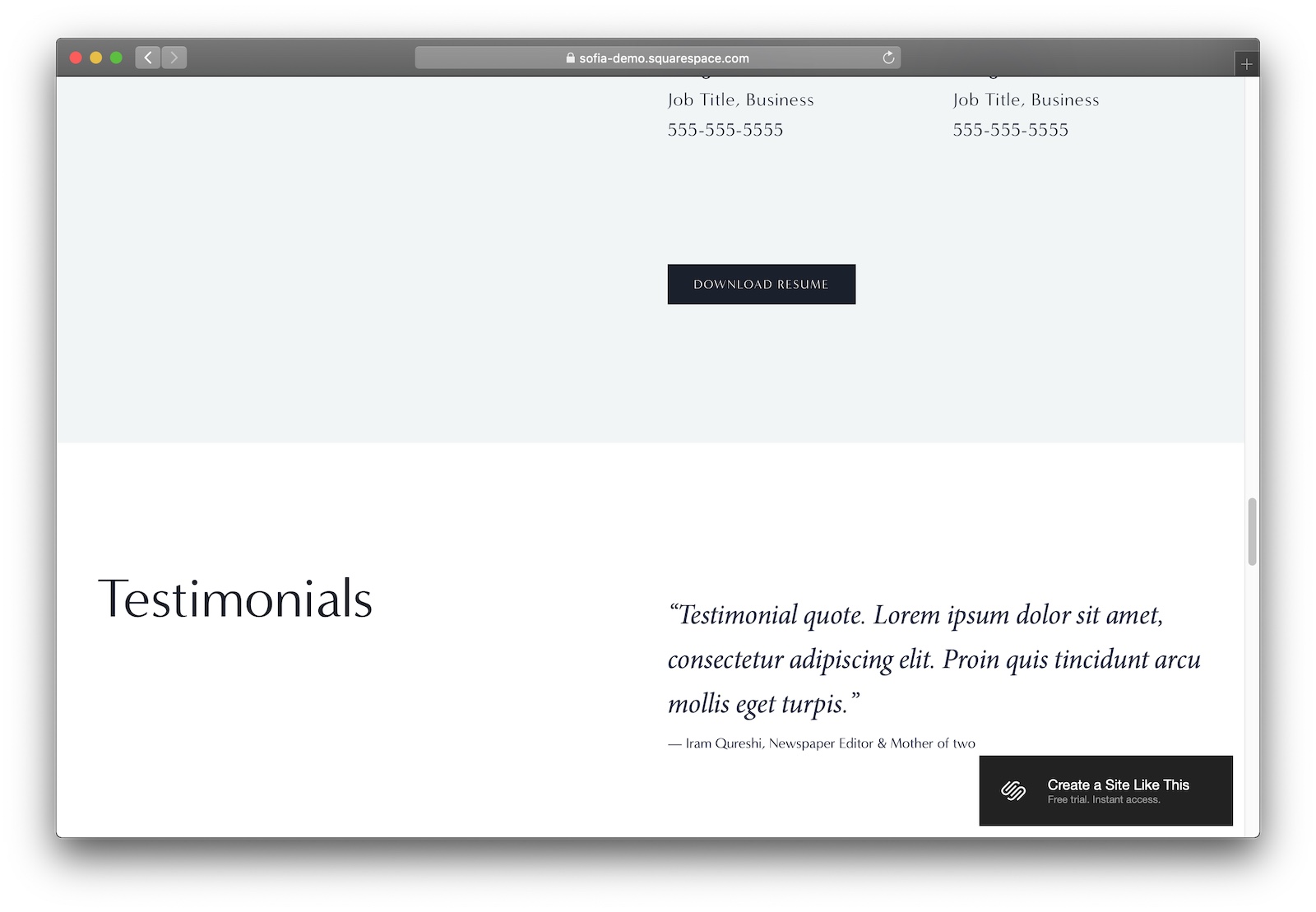
  • Make sure to include some social proof via testimonials, reviews, and referrals.

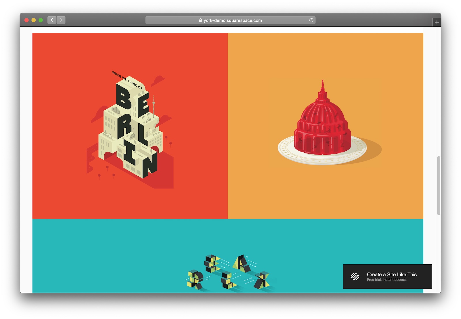
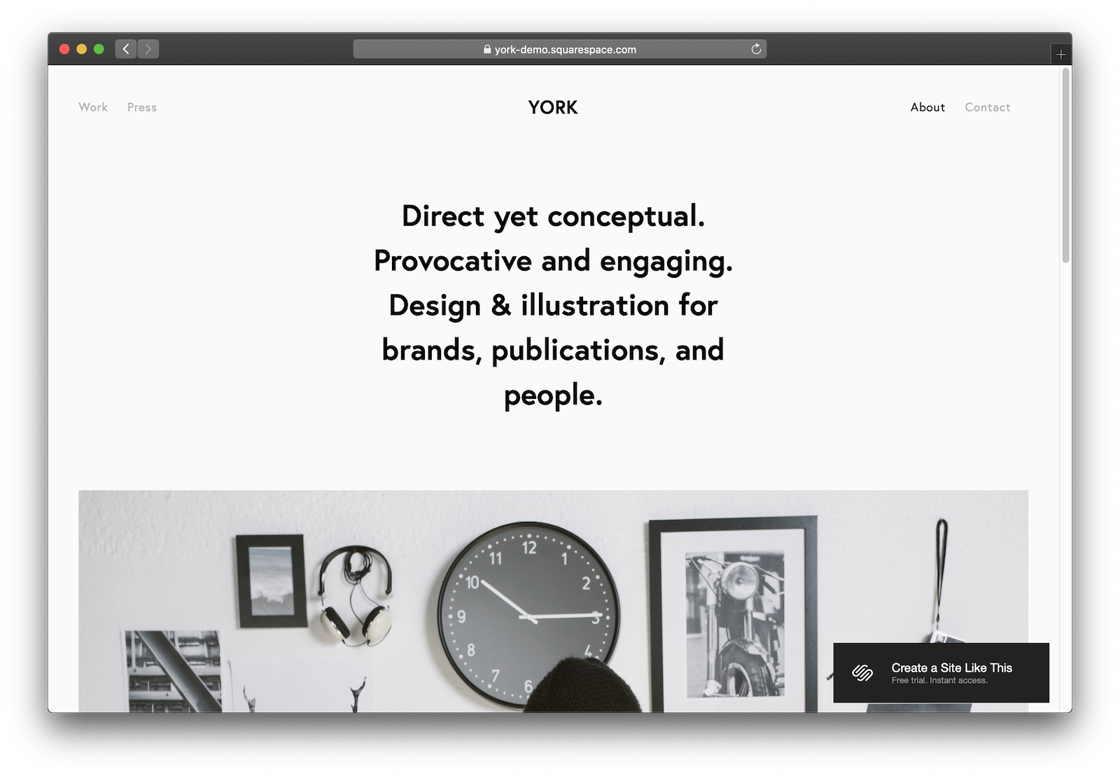
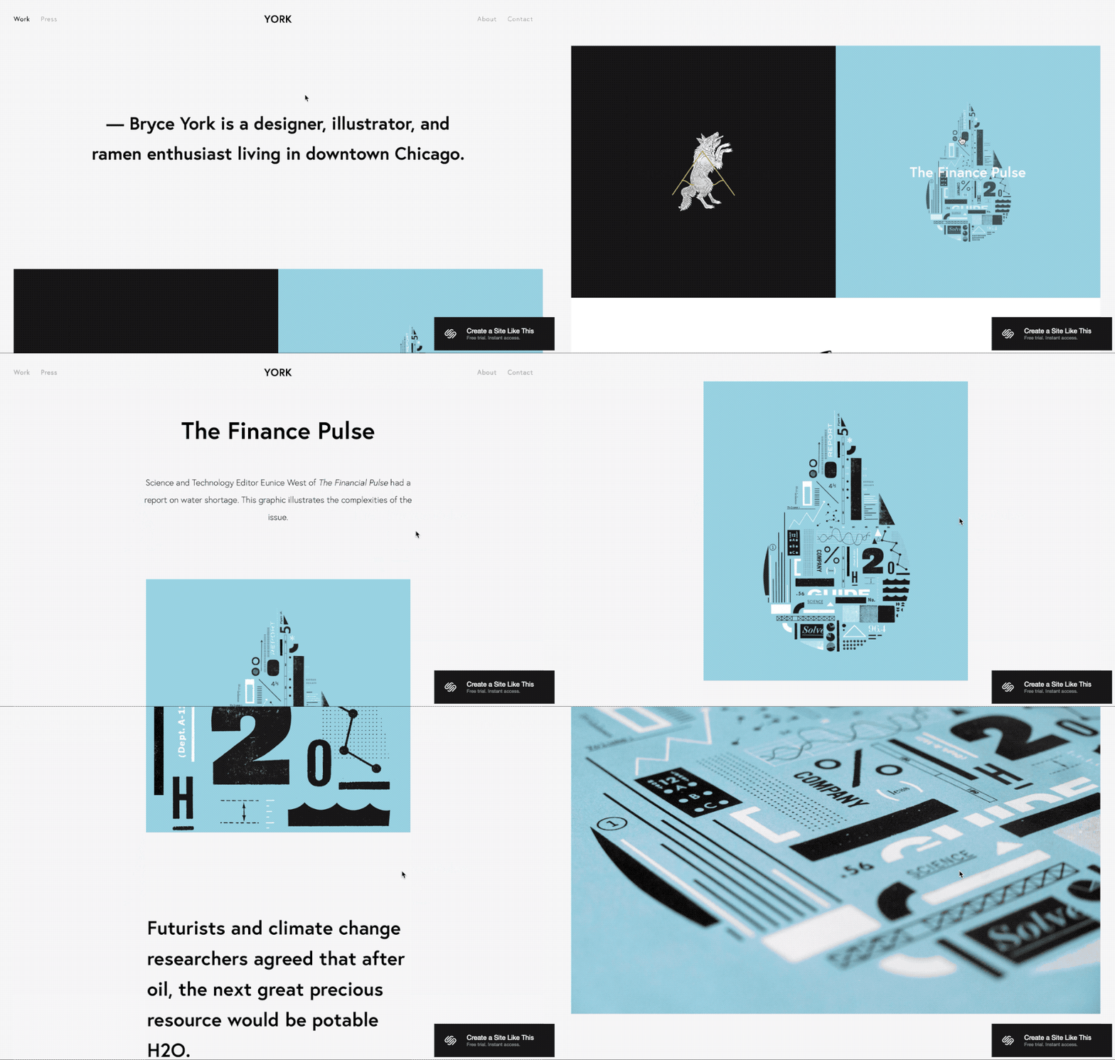
#3 York

For a big portfolio with big impact, York makes your work iconic.
Designer Notes

  • I love the navigation and loading animations that York uses. It creates a mood for the viewer that gives your work even bigger impact.
  • York’s typography is great as well, just in case you need to tell the story behind the visuals.

What’s the best Squarespace template for non-profits?

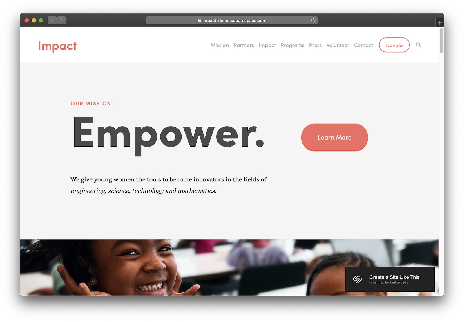
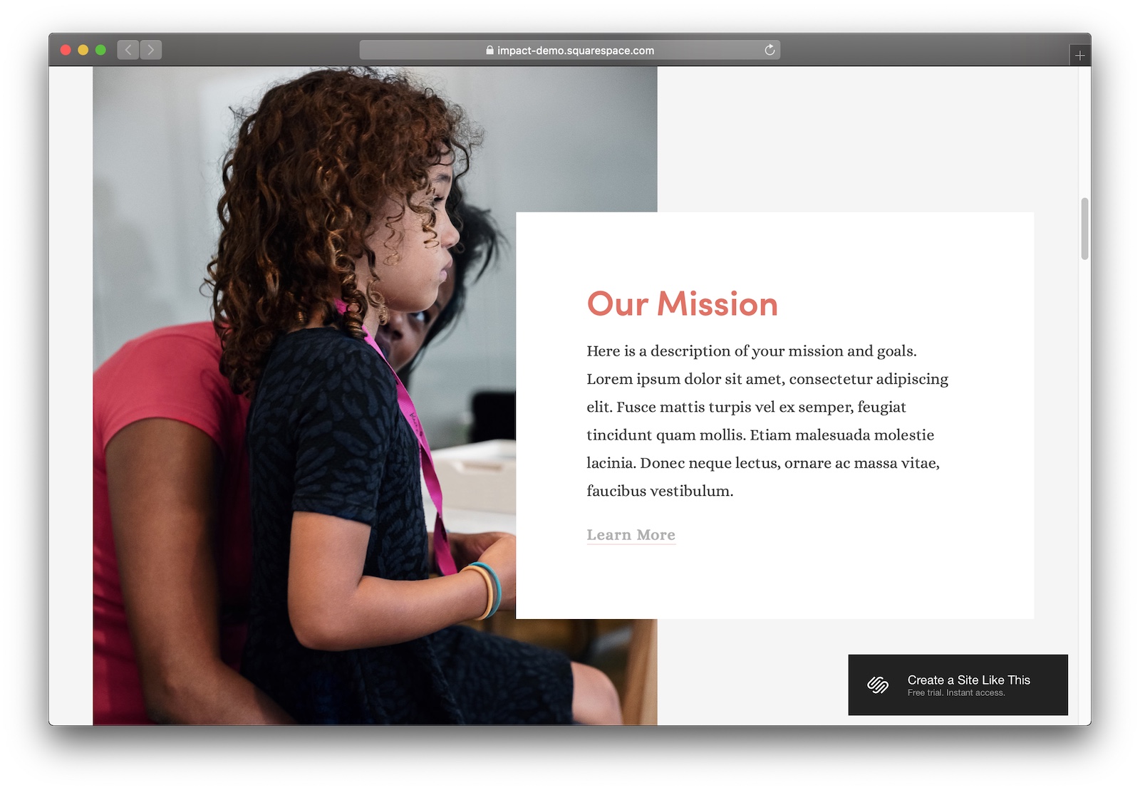
#1 Impact

A beautiful, humanistic template gets people caring about your cause.
Designer Notes

  • This template is a little different from Squarespace’s usual focus on modern and minimalist design. It’s a bit more human – I like the cartoon-y shadows on the buttons and the font. It makes it perfect for charities and community organisations – it helps visitors focus on the people behind the cause.
  • Nice call-outs throughout the template help you communicate the most important information about your non-profit. Add call-outs about your mission, your history, and your goals.
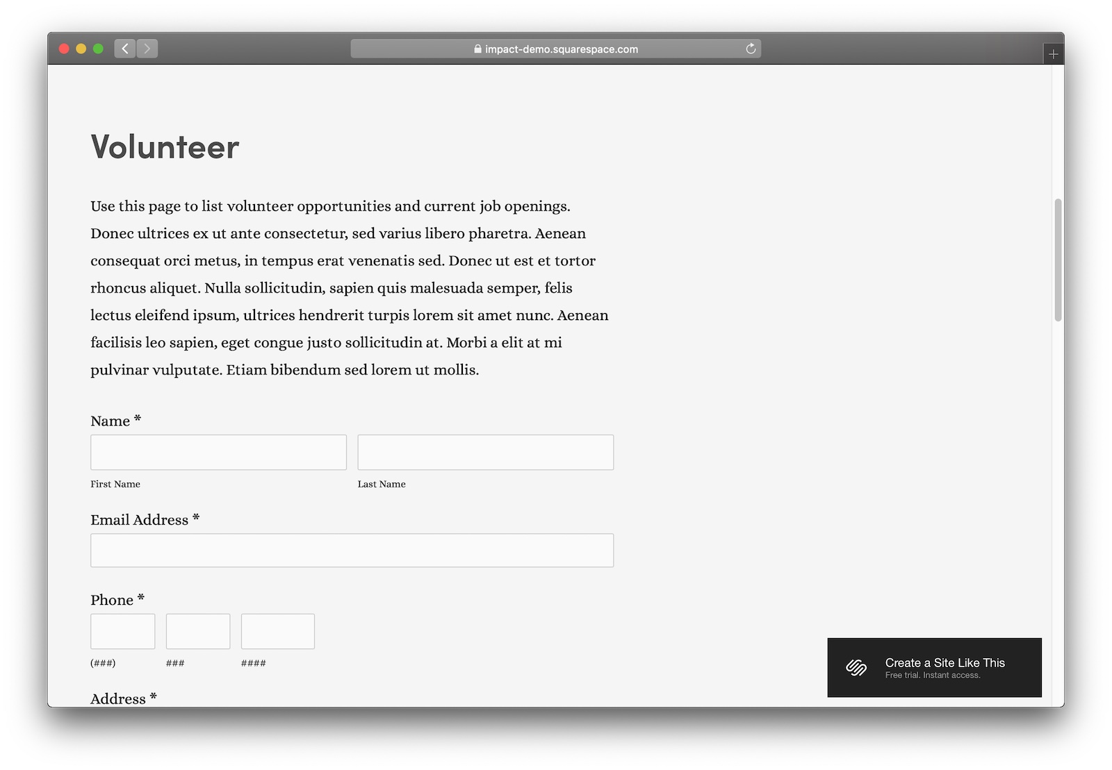
  • Impact makes it easy to drop in a couple of intuitive forms to collect contact details from people who want to help you out.

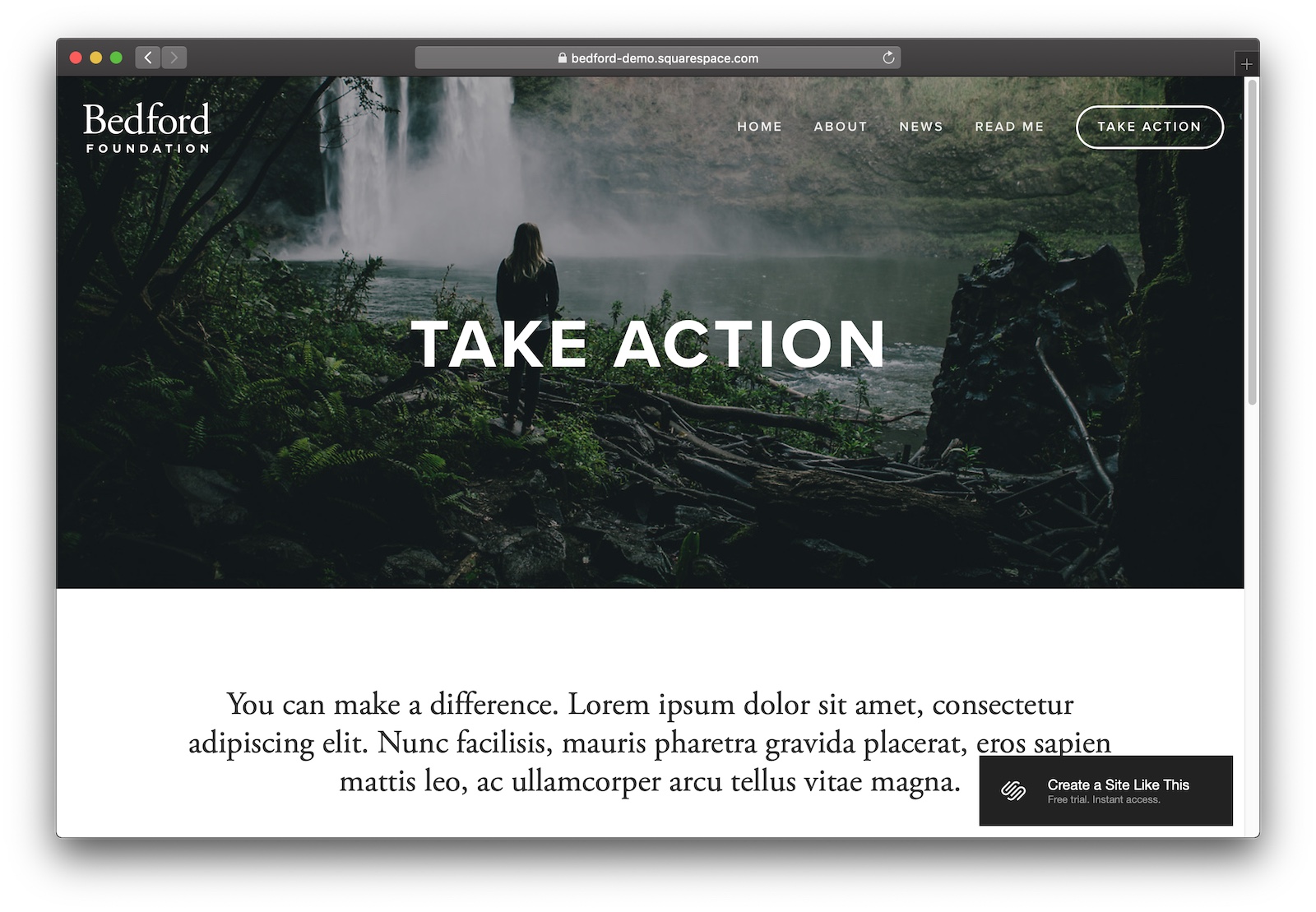
#2 Bedford

An epic template for non-profits with a huge cause.

Designer Notes

  • I quite like Bedford as a general-purpose website tempalate, and it’s even better for non-profits. It’s got everything you need – nice typography, smart layouts, a blog, and simple navigation.
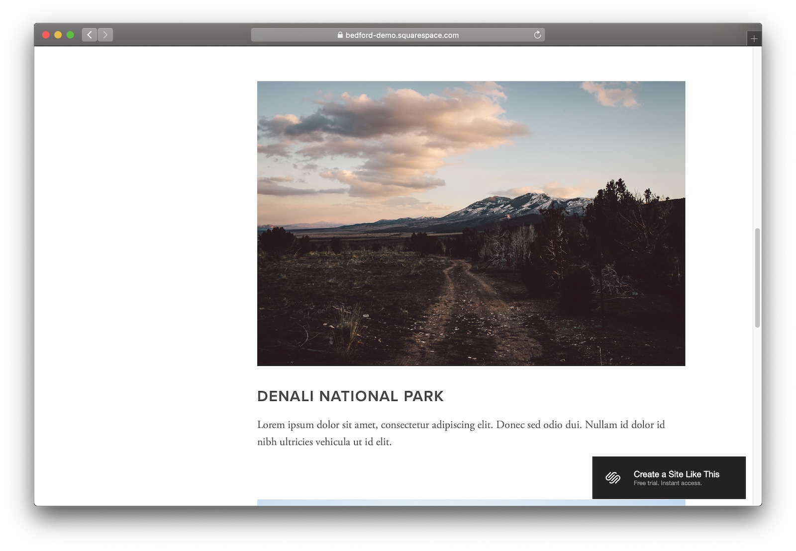
  • There’s something about how images look on Bedford – it’s just great. Make the most of it, be sure to include as many high-res images about your organisation as you can.

Peach’s

Read more about us.

Reach out to our dedicated customer support team for help with everything from sales to tech integration. Or just to say hi!

Lawyers need us to tell you that we’re not affiliated with or endorsed by Squarespace.

Terms and Conditions & Privacy Policy

Sign Up Log In